

MODERN JAPANESE TABLEWARE RESEARCH · STYLE & DESIGN
Modern Japanese Restaurant Tableware: Style & Buying Guide
Modern Japanese restaurant tableware expresses a contemporary Japanese visual identity through form, glaze, palette and proportion. It can be architectural, indigo and graphic, dark and tonal, natural and crafted, or a contemporary use of heritage pattern and color.
This guide helps owners, chefs and designers choose a direction that fits the food, room and service. Compare usable forms, surface, coordination, commercial collection depth, care and replacement. ERS connects Japanese restaurant specification and cross-collection sourcing experience with these design choices, helping buyers build a coherent tabletop instead of assembling unrelated contemporary-looking plates.
Modern Japanese tableware is an exercise in composition. Quiet, repeatable pieces establish order; pattern, contrast and expressive forms give the restaurant its identity.
From clean architectural porcelain and blue-and-white indigo patterns to charcoal ceramics, natural reactive finishes and reinterpreted heritage colors, modern Japanese tabletop design extends far beyond a single minimalist look. Explore five distinct directions—Minimal / Architectural, Indigo / Graphic, Dark / Tonal, Natural / Crafted and Heritage / Color Remixed—through commercial plates, sushi servingware, rice and noodle bowls, kobachi, sauce dishes, lacquerware and serving platters.
See how to coordinate shapes, glazes, textures and materials across complementary collections, balancing dependable everyday tableware with selective statement pieces. Eden Restaurant Supply shows how each visual direction translates to sushi bars, izakaya, ramen restaurants and contemporary Japanese dining—and how to build an assortment that complements the food and interior while remaining practical to purchase, operate and replenish.
In This Guide 10 buying decisions
Modern Japanese restaurant tableware is not one color palette, one glaze, one ceramic tradition, or one matching dinnerware set.
The strongest modern Japanese tabletops are built around the food first: the right vessel, the right proportion, the right surface, the right material, and the right degree of visual contrast for the menu and restaurant around it.
A clean white porcelain plate can belong. So can indigo-patterned ware, matte black melamine, tactile Japanese ceramics, lacquer soup bowls, restrained gray stoneware, or a highly expressive statement platter.
What matters is how the pieces are selected and how they work together.
ERS approaches a modern Japanese tabletop as a complete restaurant specification: establish the pieces the menu actually requires, choose a clear visual direction, build a dependable foundation, introduce variation deliberately, reserve the strongest pieces for places where they matter, and make sure the resulting assortment can survive restaurant service and be replenished later.
Selection basis
ERS's modern Japanese directions organize the 2026 assortment by palette, form, surface and the relationship between food and room. The comparison unit is a complete commercial tabletop, supported by useful product forms and replacement continuity. These buying directions connect Japanese specification experience with the menu; a style label remains separate from material, origin and product construction.
01MODERN JAPANESE / definition
What Modern Japanese Actually Means
Modern Japanese tableware is best understood as a contemporary way of composing the restaurant tabletop, not as a predefined dinnerware style.
Japanese dining has never depended on the Western idea that every plate, bowl, cup, and serving piece must come from one matching collection. Different forms, materials, colors, patterns, and levels of decoration can coexist on the same table because the vessel is selected in relation to the food and to the other pieces around it.
Modern Japanese restaurant design retains that freedom while editing it for contemporary service.
That may mean simplifying a traditional form. It may mean using traditional indigo against cleaner contemporary shapes. It may mean allowing the character of clay or glaze to remain visible while keeping the overall assortment restrained. It may mean using an aggressively modern matte-black bowl beside a quieter ceramic side dish. It may mean pairing commercial melamine workhorses with a small number of expressive ceramic pieces.
The result does not need to look traditional.
It needs to look intentional.
Modern Does Not Mean Minimalist
Minimal Japanese tableware is one valid expression, but it is only one.
Modern Japanese tabletops can be dark, graphic, colorful, heavily textured, materially rich, patterned, or strongly influenced by historical Japanese ceramics.
White porcelain does not become modern simply because it is plain. A reactive-glaze bowl does not become Japanese simply because it looks handmade. A black plate does not become contemporary Japanese merely because it is black.
The complete composition matters more than the individual adjective attached to the product.
Modern Japanese Does Not Mean Japandi
Japandi combines Japanese and Scandinavian design influences. It can overlap with one restrained branch of modern Japanese restaurant design, particularly where natural materials, simplicity, and muted color are concerned, but it does not define the category.
A Japanese restaurant can be modern without looking Scandinavian.
Modern Japanese Does Not Mean Omakase
Contemporary omakase restaurants frequently use modern Japanese tableware, but omakase is a service format, not a tabletop style.
An omakase counter may use restrained modern porcelain, traditional seasonal ceramics, antique ware, artist-made pottery, glass, lacquer, or a deliberately eclectic combination.
Restaurants seeking a specifically chef-driven, course-by-course premium counter aesthetic should use the Contemporary Omakase Tableware resource.
Modern Japanese Does Not Require Made-in-Japan Tableware
Country of origin matters when provenance, craft tradition, specific manufacturers, or Japanese production techniques are part of the specification.
It is not a prerequisite for achieving a modern Japanese restaurant tabletop.
The relevant question is whether the product is right for the food, the visual direction, the operation, and the larger assortment.
Explore Heritage / Traditional Japanese Tableware
- Years
- 24
- Restaurant / hospitality locations
- 24,000+
- Organizations
- 14,000+
- U.S. states
- 45+
- Cumulative tabletop purchasing
- $230M+
- Pieces supplied
- 55M+
24 Years of Restaurant Tableware Experience
For 24 years, Eden Restaurant Supply has specified, selected, sourced, evaluated, and supplied commercial tableware for more than 24,000 restaurant and hospitality locations operated by 14,000+ organizations across 45+ U.S. states—representing more than $230 million in cumulative tabletop purchasing and 55 million+ pieces supplied.
ERS's experience spans independent restaurants, chef-driven concepts, Michelin-recognized dining, hotels, institutional foodservice, high-volume operations, and regional and national multi-unit restaurant groups. Its particular depth in Asian-influenced foodservice includes sushi bars, omakase restaurants, ramen and udon shops, izakaya and yakitori concepts, Korean BBQ and Korean restaurants, hot pot and shabu-shabu, Chinese and dim sum restaurants, Vietnamese and pho concepts, Thai restaurants, and Asian-fusion and pan-Asian dining.
Experience Beyond the Sale
ERS's recommendations are informed by 24 years of first-party transaction and reorder history, hands-on product evaluation, direct manufacturer and importer relationships, and real restaurant specification work.
That experience encompasses decisions involving:
menu fit · portion presentation · plate and bowl size · shape · material · color · finish · assortment coordination · presentation level · durability · weight and handling · dishroom workflow · stacking and storage · replacement availability · reorder continuity · opening quantities · budget
ERS therefore sees restaurant tabletop not as a collection of individual products, but as a complete operating system that must work visually, commercially, and operationally.
First-Party Restaurant Tableware Intelligence
ERS's purchasing history provides a direct view into what restaurants actually buy and continue to use.
Across 55 million+ pieces supplied to 24,000+ restaurant and hospitality locations, ERS can analyze patterns such as:
most-purchased product families · common sizes and shapes · colors and finishes · material preferences · concept-specific assortments · products purchased together · opening assortment breadth · repeat purchasing · replenishment behavior · replacement patterns · changes in presentation level · changes in restaurant tabletop preferences over time
This allows ERS recommendations to be informed by observed commercial purchasing behavior, rather than trend reporting or manufacturer claims alone.
Direct Sourcing & Supply-Chain Knowledge
ERS's tableware expertise extends upstream into the supply chain through decades of direct manufacturer, factory, importer, and distributor relationships.
That includes practical knowledge of:
factory capabilities · custom decoration · custom colors and finishes · custom shapes and molds · production minimums · lead times · commercial availability · pricing architecture · discontinued patterns · replacement compatibility · replenishment risk · alternative sourcing
A tabletop specification is only successful if the restaurant can purchase it, operate with it, replace it, and continue sourcing it as the business grows.
Full Restaurant Tabletop Lifecycle
ERS has worked with restaurant tabletop throughout its complete commercial lifecycle:
- Concept & Design Determining the desired restaurant identity, guest experience, menu presentation, and appropriate tabletop investment level.
- Specification Selecting the pieces, dimensions, shapes, materials, colors, finishes, and combinations appropriate for the menu and service model.
- Purchasing Coordinating manufacturers, sourcing, pricing, availability, minimums, and project requirements.
- Opening Quantities Determining practical opening pars around seat count, menu usage, service volume, dish cycles, storage, and backup requirements.
- Operation & Replenishment Supporting ongoing purchases as pieces break, disappear, wear, or simply require additional inventory.
- Replacement & Discontinuation Finding exact replacements, compatible alternatives, or coordinated substitutes when products or patterns become unavailable.
- Expansion Reproducing or adapting established tabletop systems as restaurant groups add locations.
- Assortment Refresh Updating individual pieces or complete tabletop programs as menus, concepts, presentation standards, or restaurant positioning evolve.
What This Experience Means for the Buyer
ERS does not simply know which tableware exists.
It knows:
what restaurants buy · what different concepts actually need · what pieces work together · what is repeatedly reordered · where higher tabletop investment is worthwhile · where economical workhorse pieces make more sense · what can survive commercial service · what can be replenished later · and how to build a complete assortment around a restaurant's menu, operation, aesthetic, and budget.
That combination of 24 years of specification experience, 24,000+ locations, 14,000+ operators, $230M+ in commercial tabletop purchasing, 55M+ pieces supplied, first-party reorder evidence, hands-on product knowledge, and direct sourcing expertise is the foundation of ERS's restaurant tableware research and recommendations.
02MODERN JAPANESE / directions
Choose Your Modern Japanese Direction
A strong tabletop starts with a clear visual direction. That does not mean every piece needs to belong to the same collection. It means the restaurant should know what visual language it is trying to establish before it begins accumulating individual products.
Minimal / Architectural
Minimal / Architectural Modern Japanese relies on form before decoration.
The strongest pieces have clean silhouettes, deliberate proportions, restrained surfaces, and enough precision that the shape itself carries the design. White and ivory work naturally here, but so do gray, charcoal, black, pale earth tones, and muted natural finishes.
Round plates and bowls can form the foundation. Rectangular ware introduces structure. A small number of unusual proportions or architectural serving pieces can add distinction without breaking the restraint.
This direction works especially well for contemporary Japanese full-service restaurants, modern sushi bars, refined ramen concepts, Asian-fusion restaurants, and hotel dining where tableware needs to integrate cleanly with a larger interior language.
The mistake is making everything so quiet that the tabletop loses identity.
A Minimal / Architectural assortment still needs contrast—through profile, scale, depth, texture, or a small number of stronger pieces.
What to buy
Foundation: clean plates, bowls, sauce dishes, and high-use service pieces with controlled geometry.
Supporting pieces: related forms that change depth, profile, or tone without changing the entire visual language.
Statement pieces: one sculptural platter, unusual low bowl, architectural rectangular plate, or materially richer accent.
 Foundation10-3/4" Porcelain Plate, White
Repeated geometry and a controlled ground.
$11.49
Foundation10-3/4" Porcelain Plate, White
Repeated geometry and a controlled ground.
$11.49
 Foundation10-1/4" x 7" Rectangular Porcelain Plate, White
Repeated geometry and a controlled ground.
$7.19
Foundation10-1/4" x 7" Rectangular Porcelain Plate, White
Repeated geometry and a controlled ground.
$7.19
 Foundation5"D Rice Bowl, White Ceramic
Repeated geometry and a controlled ground.
$2.75
Foundation5"D Rice Bowl, White Ceramic
Repeated geometry and a controlled ground.
$2.75
 Supporting3-7/8"x2-3/8" Rectangular Sauce Dish, White Ceramic
A deliberate change in depth, tone or pattern.
$1.50
Supporting3-7/8"x2-3/8" Rectangular Sauce Dish, White Ceramic
A deliberate change in depth, tone or pattern.
$1.50
 Supporting7-1/8" Square Bowl, White Ceramic
A deliberate change in depth, tone or pattern.
$4.75
Supporting7-1/8" Square Bowl, White Ceramic
A deliberate change in depth, tone or pattern.
$4.75
 Statement9-1/4" Slanted Bowl, White Ceramic
Concentrated presentation emphasis.
$10.95
Statement9-1/4" Slanted Bowl, White Ceramic
Concentrated presentation emphasis.
$10.95
Indigo / Graphic Contemporary
Blue-and-white Japanese tableware has enormous historical depth, but it does not need to look historical.
In a contemporary restaurant, indigo and blue work best when pattern has hierarchy.
A quiet white or lightly blue foundation allows graphic linework, radial patterns, brush-like decoration, or stronger Japanese motifs to register without turning every square inch of the table into visual noise.
The strongest Indigo / Graphic tabletops are often less patterned than expected.
One large platter, several small accent dishes, or one clearly graphic bowl family can establish the identity while the highest-use pieces remain quieter.
That is especially effective for sushi, Japanese full-service, izakaya, and restaurants that want recognizably Japanese tableware without moving toward a traditional dining-room aesthetic.
What to buy
Foundation: white, ivory, pale blue, or restrained blue-white ware.
Supporting pieces: related indigo patterns, blue rims, subtle linework, or quieter Japanese graphics.
Statement pieces: large sushi plates, elongated platters, strongly patterned serving pieces, or larger blue-white bowls.
Avoid using five unrelated blue-and-white patterns simply because all five contain blue.
The color alone is not enough to coordinate them.
 Foundation9" Ceramic Dinner Plate, Blue — Fubuki Tokusa Design
Repeated geometry and a controlled ground.
$15.99
Foundation9" Ceramic Dinner Plate, Blue — Fubuki Tokusa Design
Repeated geometry and a controlled ground.
$15.99
 Foundation4-1/2"D Rice Bowl, White Ceramic
Repeated geometry and a controlled ground.
$1.50
Foundation3-7/8"x2-3/8" Rectangular Sauce Dish, White Ceramic
Repeated geometry and a controlled ground.
$1.50
Foundation4-1/2"D Rice Bowl, White Ceramic
Repeated geometry and a controlled ground.
$1.50
Foundation3-7/8"x2-3/8" Rectangular Sauce Dish, White Ceramic
Repeated geometry and a controlled ground.
$1.50
 SupportingRound Shallow Bowl 4.25", Blue
A deliberate change in depth, tone or pattern.
$4.80
SupportingRound Shallow Bowl 4.25", Blue
A deliberate change in depth, tone or pattern.
$4.80
 Supporting6.35" Square Ceramic Plate, White, Blue
A deliberate change in depth, tone or pattern.
$8.59
Supporting6.35" Square Ceramic Plate, White, Blue
A deliberate change in depth, tone or pattern.
$8.59
 StatementBlue Round Plate 12"
Concentrated presentation emphasis.
$25.95
StatementBlue Round Plate 12"
Concentrated presentation emphasis.
$25.95

Dark / Tonal Contemporary
A dark tabletop does not become sophisticated by making every piece the same shade of matte black.
The strongest Dark / Tonal programs use a narrow palette but vary surface, material, depth, and tone.
Black can sit beside charcoal. Charcoal can sit beside blue-black. A matte melamine foundation can work with glazed ceramic servingware. A satin bowl can sit beside a rougher dark platter. Warm brown-black or deep green can keep an otherwise monochromatic assortment from becoming visually dead.
This direction is particularly effective for contemporary sushi, izakaya, Japanese full-service, Asian fusion, and chef-driven restaurants where light-colored food or vivid garnish benefits from strong contrast.
Commercial melamine belongs here when the operation needs it.
There is no reason a high-volume modern Japanese restaurant should sacrifice its entire visual identity simply because breakage, weight, or replacement cost matters.
What to buy
Foundation: high-use dark plates, bowls, and smallware with dependable availability and restaurant-appropriate handling.
Supporting pieces: related dark tones and different surface treatments.
Statement pieces: deeper reactive glazes, sculptural dark ceramics, dramatic platters, or specialty servingware.
The goal is tonal depth, not black repetition.
 FoundationMelamine Rectangular Plate 8-7/8”*3-3/4", Matte Black
Repeated geometry and a controlled ground.
$4.75
FoundationMelamine Rectangular Plate 8-7/8”*3-3/4", Matte Black
Repeated geometry and a controlled ground.
$4.75
 Foundation4.25"Dx2.5"H Porcelain Rice Bowl, Matte Black
Repeated geometry and a controlled ground.
$3.25
Foundation4.25"Dx2.5"H Porcelain Rice Bowl, Matte Black
Repeated geometry and a controlled ground.
$3.25
 Foundation3.25"Dx1"H Porcelain Sauce Dish, Black
Repeated geometry and a controlled ground.
$2.95
Foundation3.25"Dx1"H Porcelain Sauce Dish, Black
Repeated geometry and a controlled ground.
$2.95
 SupportingCeramic Bowl — 36 fl. oz., Black
A deliberate change in depth, tone or pattern.
$6.79
SupportingCeramic Bowl — 36 fl. oz., Black
A deliberate change in depth, tone or pattern.
$6.79
 Supporting13.25" x 4" Ceramic Plate, Black
A deliberate change in depth, tone or pattern.
$10.09
Supporting13.25" x 4" Ceramic Plate, Black
A deliberate change in depth, tone or pattern.
$10.09
 Statement20"X6.25" Rectangular Porcelain Platter, Black Oribe
Concentrated presentation emphasis.
$19.75
Statement20"X6.25" Rectangular Porcelain Platter, Black Oribe
Concentrated presentation emphasis.
$19.75
Natural / Crafted Contemporary
Natural / Crafted Modern Japanese is not a license to fill the table with rough-edged reactive-glaze pottery.
The strongest versions are controlled.
Cream, stone, warm white, brown, gray, muted blue, and subdued green can create a quiet foundation. More expressive glaze movement, exposed material character, wheel marks, organic geometry, crackle, or tonal variation can then be introduced selectively.
This works especially well for chef-driven Japanese restaurants, elevated izakaya, modern full-service, Asian fusion, and restaurants whose interiors already use wood, stone, plaster, or other natural materials.
The visual interest comes from material character, but the restaurant still needs hierarchy.
If every bowl has dramatic glaze movement, every plate has an irregular edge, every sauce dish is a different color, and every serving piece has a different clay body, the result is not “crafted.” It is uncontrolled.
What to buy
Foundation: restrained ceramics or porcelain with enough warmth or surface character to establish the direction.
Supporting pieces: related earth-tone, glazed, or lightly irregular pieces.
Statement pieces: the strongest reactive, organic, textural, or craft-forward ware.
 Foundation13.35" x 4" Rectangular Ceramic Sushi Plate, Beige, Blue, Brown
Repeated geometry and a controlled ground.
$14.29
Foundation13.35" x 4" Rectangular Ceramic Sushi Plate, Beige, Blue, Brown
Repeated geometry and a controlled ground.
$14.29
 FoundationCeramic Large Bowl - 7"D x 2"H
Repeated geometry and a controlled ground.
$8.59
FoundationCeramic Large Bowl - 7"D x 2"H
Repeated geometry and a controlled ground.
$8.59
 FoundationCeramic Bowl — 5 fl. oz., Brown
Repeated geometry and a controlled ground.
$3.99
FoundationCeramic Bowl — 5 fl. oz., Brown
Repeated geometry and a controlled ground.
$3.99
 SupportingCeramic Bowl — 16 fl. oz., Gray
A deliberate change in depth, tone or pattern.
$6.79
SupportingCeramic Bowl — 16 fl. oz., Gray
A deliberate change in depth, tone or pattern.
$6.79
 Supporting13.75" x 9.5" Rectangular Ceramic Serving Platter, Brown, Gray
A deliberate change in depth, tone or pattern.
$55.99
Supporting13.75" x 9.5" Rectangular Ceramic Serving Platter, Brown, Gray
A deliberate change in depth, tone or pattern.
$55.99
 Statement16" x 7" Leaf Ceramic Serving Platter, Green, Brown
Concentrated presentation emphasis.
$48.99
Statement16" x 7" Leaf Ceramic Serving Platter, Green, Brown
Concentrated presentation emphasis.
$48.99
Heritage / Color Remixed
Traditional Japanese tableware vocabulary can sit comfortably inside a modern restaurant when it is edited rather than reproduced indiscriminately.
Blue-and-white patterns, lacquer red and black, traditional bowl forms, historical Japanese color combinations, inherited motifs, and recognizably Japanese serving shapes can all be used in contemporary spaces.
The difference is concentration.
A modern restaurant rarely needs every item on the table to announce its Japanese identity at once.
A simple contemporary foundation makes one traditional patterned platter more powerful. A lacquer soup bowl has more presence beside quieter ceramics. A classic motif feels fresher when it appears on selected pieces instead of across the entire place setting.
This direction is particularly useful for restaurants that want guests to read the tabletop as unmistakably Japanese while retaining contemporary presentation.
What to buy
Foundation: quiet contemporary ware.
Supporting pieces: traditional colors and forms.
Statement pieces: explicit Japanese pattern, lacquer, heritage servingware, or a highly recognizable traditional-reference vessel.
 Foundation7-7/8" Round Plate, White Ceramic
Repeated geometry and a controlled ground.
$3.50
Foundation7-7/8" Round Plate, White Ceramic
Repeated geometry and a controlled ground.
$3.50
 FoundationLacquer Miso Soup Bowl, Red
Repeated geometry and a controlled ground.
$2.95
FoundationLacquer Miso Soup Bowl, Red
Repeated geometry and a controlled ground.
$2.95
 Foundation3.5" Ceramic Plate, Blue — Apricot Blossom Design
Repeated geometry and a controlled ground.
$4.29
Foundation3.5" Ceramic Plate, Blue — Apricot Blossom Design
Repeated geometry and a controlled ground.
$4.29
 Supporting9" Square Ceramic Deep Plate, Beige, Brown — Plum Blossom Design
A deliberate change in depth, tone or pattern.
$12.99
Supporting9" Square Ceramic Deep Plate, Beige, Brown — Plum Blossom Design
A deliberate change in depth, tone or pattern.
$12.99
 SupportingJapanese Green Bamboo Sake 5-Piece Set 1:4
A deliberate change in depth, tone or pattern.
$37.99
SupportingJapanese Green Bamboo Sake 5-Piece Set 1:4
A deliberate change in depth, tone or pattern.
$37.99
 Statement12.75" x 6.25" Ceramic Plate, Green — Oribe Design
Concentrated presentation emphasis.
$37.99
Statement12.75" x 6.25" Ceramic Plate, Green — Oribe Design
Concentrated presentation emphasis.
$37.99
03MODERN JAPANESE / ingredients
What Creates the Look
The five directions above are outcomes. The actual specification is built from a smaller number of decisions: color, surface, form, pattern, material, and the degree of traditional reference.
Color
White & Ivory
White gives the food maximum visual control and places the design burden on shape, proportion, finish, and the surrounding pieces.
It is particularly strong in Minimal / Architectural tabletops and as a quiet foundation beneath patterned or crafted accents.
Do not confuse white with generic.
A strong white Japanese tabletop is distinguished through:
profile · depth · rim · foot · proportion · geometry · surface
rather than color.


Indigo & Blue
Blue remains one of the most durable visual languages in Japanese tabletop purchasing.
ERS first-party purchasing history confirms that blue and blue-white tableware remain persistent commercial choices across Japanese restaurant concepts even as darker, more natural, and more contemporary finishes have expanded.
Use blue as either:
a foundation tone
or
a graphic accent
—not automatically both everywhere.

Black, Charcoal & Deep Tones
Dark ware has expanded substantially across contemporary Japanese and broader Asian-influenced restaurants.
ERS's first-party history confirms sustained growth in dark and tonal finishes, especially where operators want stronger food contrast and a more contemporary presentation language.
The important distinction is surface.
matte black
gloss black
charcoal
blue-black
brown-black
dark reactive glaze
behave differently even when photographed in the same tonal family.


Earth & Stone
Natural tones have also strengthened materially in contemporary restaurant assortments.
Cream, sand, stone, taupe, brown, muted gray, and desaturated natural color create an easier bridge between modern Japanese food presentation and interiors built around wood, stone, concrete, and plaster.
They are particularly effective where the food itself should provide most of the color.


Color Beyond Neutrals
Modern Japanese does not end at earth tones.
Muted green, celadon-like colors, stronger blue, red accents, lacquer colors, ochre, and other historically rooted Japanese colors can create a more specific and memorable tabletop.
The discipline is deciding where the color belongs.


Surface & Finish
Gloss
Clean, reflective, visually crisp.
Useful when the shape or pattern should carry more of the design load.

Satin
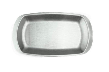
A useful middle ground between high-gloss formality and fully matte surfaces.
Matte
Strong contemporary visual weight, particularly in dark programs.
Matte should not automatically be treated as premium. Evaluate marking, wear, food contrast, and maintenance at product level.

Reactive & Variable Glaze
Reactive glaze adds depth and visible variation.
ERS first-party purchasing shows continued demand for these treatments in elevated contemporary concepts, but the strongest assortments do not make every piece reactive.
Use glaze movement where visual character matters.
Keep enough quiet ware around it for the variation to register.

Texture
Texture can create visual and tactile depth without relying on pattern.
Use it selectively on pieces that can still be cleaned, handled, stacked, and replenished appropriately for the operation.

Crackle & Artisan-Like Surface
These treatments can be highly effective in Natural / Crafted and Heritage / Color Remixed tabletops.
Never infer care or durability from appearance alone. Product-level specifications control.

Form
Round
Round remains the workhorse because it handles an enormous range of food well.
Modernity comes from proportion and profile, not from abandoning the circle.

Coupe / Low Rim
Useful where the restaurant wants a larger visual field around the food while maintaining enough edge for service.

Rectangular
A core Japanese presentation form, particularly effective for:
sushi · sashimi · grilled items · shared appetizers · composed small courses
Its operational penalty is footprint. Buy the form deliberately.
Square & Angular
Stronger architectural expression.
Use selectively. Too many competing angular forms can make the tabletop feel overly constructed.

Organic / Irregular
Best used when the irregularity adds meaningful character.
Do not mistake an uneven edge for a complete design strategy.
Deep vs Shallow
This is a functional decision first.
The food determines the required depth.
The visual direction chooses which appropriate vessel within that category to use.


Pattern
Pattern carries more visual intensity than most buyers expect.
A patterned plate that looks subtle by itself can become dominant once it is surrounded by several other patterned pieces.
For most contemporary programs:
plain foundation → selective pattern → one or two high-impact pieces
is substantially easier to control than universal decoration.
Use:
linework · blue-white pattern · brush-style graphic · heritage motif · highly graphic statement
with clear hierarchy.


Material
Material changes both appearance and operation.
Porcelain can deliver precision, refinement, consistent geometry, and strong commercial versatility.
Ceramic / stoneware-type products bring greater visual emphasis to clay, glaze, surface, and material variation.
Melamine can provide serious contemporary design with lower weight and much lower breakage exposure.
Lacquerware remains highly relevant where the food and service format warrant it.
Wood, bamboo, glass, and metal should be added where they solve a real visual or service need—not simply to claim that the assortment uses mixed materials.


04MODERN JAPANESE / coordination
Build a Coordinated Tabletop
A restaurant does not need a matching dinnerware set.
It does need a reason for the pieces to belong together.
ERS divides the assortment into three practical roles.
Foundation Pieces
Foundation pieces carry the restaurant.
They are generally:
high use · high par · broadly reusable · visually stable · operationally dependable · replenishable
Typical foundation categories include:
rice bowls · soup bowls · everyday small plates · core entrée plates · sauce dishes · primary noodle bowls · common side bowls
Their design does not need to be anonymous.
But a foundation piece should rarely be the hardest product in the entire program to replace.
Supporting Pieces
Supporting pieces introduce controlled difference.
They can vary:
shape · depth · glaze · material · color · pattern
while retaining enough connection to the foundation that the tabletop remains coherent.
They are where much of the assortment's personality develops.
Statement Pieces
Statement pieces are where the restaurant spends visual capital.
They may be:
signature sushi platters · large presentation plates · specialty bowls · low-par courseware · unusual serving vessels · premium sake ware · strongly glazed or patterned pieces
A statement piece should justify its presence.
If a product is expensive, difficult to store, highly specialized, or less replaceable, it should earn that burden through actual presentation value.
Use an Anchor
A mixed tabletop needs at least one visual relationship that repeats.
That relationship may be:
color
glaze character
material
geometry
rim/profile
proportion
pattern language
deliberate contrast
Blue patterned plates and plain white bowls can work because the white ground repeats.
A dark matte plate and a natural brown bowl can work because both share low saturation and material weight.
A highly irregular statement plate can work beside clean foundation pieces because the contrast is deliberate.
The question is not:
Do these match?
The better question is:
Why do these belong together?
Do Not Vary Everything at Once
If shape changes dramatically, hold color or material relatively stable.
If glaze changes dramatically, repeat geometry.
If several materials are used, tighten the palette.
If one piece is highly patterned, make its immediate neighbors quieter.
If a statement vessel already has:
strong color + irregular shape + heavy texture + reactive glaze
it does not need an equally aggressive plate underneath it.
Control Visual Intensity
Pattern, color, glaze movement, texture, irregularity, material contrast, and scale all consume visual attention.
A well-specified tabletop distributes that attention.
A poorly specified one spends it everywhere.
ERS first-party purchasing and reorder behavior consistently support the commercial logic behind this distinction: the pieces restaurants reorder most heavily tend to be dependable, repeatable workhorses, while more expressive specialty pieces occupy narrower applications and lower pars.
That is not a compromise.
It is usually what allows the expressive pieces to remain expressive.
Example 1 — Indigo + White
Foundation: restrained white/blue plates and bowls.
Supporting: several indigo-patterned small dishes.
Statement: one large graphic serving platter.
Why it works: repeated white and blue create continuity while pattern intensity changes by piece.
Foundation7-7/8" Round Plate, White Ceramic
$3.50
Foundation4-1/2"D Rice Bowl, White Ceramic
$1.50
Foundation3-7/8"x2-3/8" Rectangular Sauce Dish, White Ceramic
$1.50
SupportingRound Shallow Bowl 4.25", Blue
$4.80
Supporting6.35" Square Ceramic Plate, White, Blue
$8.59
StatementBlue Round Plate 12"
$25.95
Example 2 — Dark + Natural
Foundation: matte or satin dark high-use ware.
Supporting: quiet earth-tone ceramics.
Statement: one stronger glazed or organic serving piece.
Why it works: narrow color range, strong material contrast.
Foundation4.25"Dx2.5"H Porcelain Rice Bowl, Matte Black
$3.25
Foundation3.25"Dx1"H Porcelain Sauce Dish, Black
$2.95
Foundation13.25" x 4" Ceramic Plate, Black
$10.09
 SupportingCeramic Bowl — 10 fl. oz., Brown
$2.09
SupportingCeramic Bowl — 5 fl. oz., Brown
$3.99
Statement16" x 7" Leaf Ceramic Serving Platter, Green, Brown
$48.99
SupportingCeramic Bowl — 10 fl. oz., Brown
$2.09
SupportingCeramic Bowl — 5 fl. oz., Brown
$3.99
Statement16" x 7" Leaf Ceramic Serving Platter, Green, Brown
$48.99
Example 3 — Minimal + Crafted
Foundation: architectural white/gray pieces.
Supporting: one natural ceramic family.
Statement: a highly tactile platter or bowl.
Why it works: geometry supplies order while material supplies personality.
Foundation10-3/4" Porcelain Plate, White
$11.49
Foundation5"D Rice Bowl, White Ceramic
$2.75
Foundation3-7/8"x2-3/8" Rectangular Sauce Dish, White Ceramic
$1.50
SupportingCeramic Large Bowl - 7"D x 2"H
$8.59
SupportingCeramic Bowl — 16 fl. oz., Gray
$6.79
 Statement15.5" x 11.65" Rectangular Ceramic Plate, Beige, Brown
$78.99
Statement15.5" x 11.65" Rectangular Ceramic Plate, Beige, Brown
$78.99
Example 4 — Heritage + Contemporary
Foundation: clean contemporary ware.
Supporting: blue-white or lacquer accents.
Statement: one explicitly traditional-reference piece.
Why it works: traditional identity is concentrated rather than repeated indiscriminately.
 Foundation7"x5" Rectangular Plate, White Ceramic
$4.50
Foundation4-1/2"D Rice Bowl, White Ceramic
$1.50
Foundation7"x5" Rectangular Plate, White Ceramic
$4.50
Foundation4-1/2"D Rice Bowl, White Ceramic
$1.50
 Foundation3" Round Sauce Dish, White Ceramic
$1.25
SupportingLacquer Miso Soup Bowl, Red
$2.95
Foundation3" Round Sauce Dish, White Ceramic
$1.25
SupportingLacquer Miso Soup Bowl, Red
$2.95
 SupportingJapanese Blue Bamboo Sake 5-Piece Set 1:4
$37.99
Statement12.75" x 6.25" Ceramic Plate, Green — Oribe Design
$37.99
SupportingJapanese Blue Bamboo Sake 5-Piece Set 1:4
$37.99
Statement12.75" x 6.25" Ceramic Plate, Green — Oribe Design
$37.99
05MODERN JAPANESE / applications
Food & Concept Applications
Choose the Vessel Around the Food
Modern Japanese styling begins after the vessel is functionally correct.
A beautifully glazed bowl with the wrong usable volume is the wrong bowl.
A dramatic rectangular plate that consumes too much table space for the service model is the wrong plate.
A fragile specialty dish used four times per seat per turn is probably being asked to do the wrong job.
Nigiri & Sushi Rolls
Start with:
piece count · usable length · negative space · garnish · sauce application
Rectangular and elongated plates work naturally, but round and irregular plates can work equally well when their usable surface fits the presentation.
For multi-roll service, check actual usable area rather than judging from external dimensions alone.
 5-7/8"x4" Rectangular Plate, White CeramicView Product
 11.25" x 5" Rectangular Ceramic Sushi Plate, Black, WhiteView Product
 8.75"X5" Rectangular Porcelain Plate, Reactive Glaze - Blue/BlackView Product
 6.5" Irregular Ceramic Plate, Beige, Pink — Sakura DesignView Product
 Melamine Rectangular Plate 8-7/8”*3-3/4", Matte BlackView Product
 15-5/8" x 7-1/2" Rectangular Porcelain Plate, WhiteView Product
Sashimi
Sashimi benefits from more presentation space.
The vessel may need to accommodate:
fish · garnish · shiso · daikon · ice · sauce elements · height
Color contrast becomes particularly important because the food itself often carries strong natural color.
This is one of the categories where a statement plate can justify meaningful investment.


Small Appetizers & Side Dishes
Japanese service uses a high number of small vessels because different foods often benefit from distinct forms.
The restaurant still needs discipline.
Small dishes should be selected around:
actual portion · sauce/liquid · table density · frequency · storage · replacement
not because they look attractive as individual objects.


Sauce & Condiment Dishes
These are high-frequency utility pieces.
Prioritize:
appropriate capacity · small footprint · stackability · price · replacement · coordination
Do not overspend on a piece that appears multiple times per seat unless the restaurant's concept specifically warrants it.


Rice Bowls
The rice bowl should fit the restaurant's actual portion and service style.
Consider:
diameter · depth · rim · foot · hand-feel · heat · weight
A restaurant serving rice as a side has a different requirement from one building an entire donburi menu around the bowl.

Miso & Soup
For hand-held soup service, material, weight, rim, and thermal behavior matter.
Lacquerware can remain particularly effective here because its lightness and tactile character solve a real service function rather than merely contributing traditional appearance.
Ceramic and other appropriate materials can also work where the concept and food warrant them.


Ramen, Udon & Soba
The primary bowl carries enormous visual and operational weight.
Specify:
usable capacity · rim diameter · depth · topping area · broth volume · weight · heat · dishwasher/storage reality
before considering color and glaze.
For a bowl-led concept, this is where tabletop spending should begin.
See: Japanese Noodle Restaurant Tableware: Ramen, Udon & Soba

Donburi & Curry
The hero bowl must balance:
portion · sauce · depth · topping visibility · service weight · table presence
A beautiful shallow bowl that cannot contain the intended curry portion is not a premium specification.
It is simply incorrect.

Shared Plates & Platters
Shared servingware needs:
reach · stability · usable area · portion capacity · table footprint
Large rectangular ware can be visually powerful but should be evaluated against actual table dimensions and the number of simultaneous dishes expected.

Tasting & Chef-Driven Courses
These are natural statement-piece applications.
Lower frequency and lower par allow greater freedom in:
shape · material · glaze · pattern · price · specialization
This is exactly where a restaurant can introduce pieces that would be operationally excessive as foundations.

Modern Japanese Tableware by Restaurant Type
Sushi & Omakase
The tabletop carries course presentation.
Invest most heavily where individual dishes need differentiation:
sushi plates · sashimi plates · small courseware · serving pieces · sake
Keep high-frequency utility pieces quieter and dependable.
Ramen, Udon & Soba
The primary bowl dominates.
Get the bowl right first.
Side plates, spoons, rice bowls, and small dishes should support it rather than compete with it.
Izakaya & Yakitori
Izakaya naturally supports a broader mix of small and shared ware.
Controlled variety is an advantage here.
SKU proliferation is not.
Build a strong smallware foundation, then allow greater variation in:
grilled-item plates · shared dishes · small bowls · specialty plates
Donburi & Japanese Rice / Curry
A narrower assortment can still establish a strong identity because the primary bowl has such high visual frequency.
Spend around the hero bowl first, then coordinate sides, soup, spoons/chopsticks, and small plates.
Japanese Full-Service
This is where the full Modern Japanese composition model becomes most important.
The restaurant may need:
entrée plates · rice · soup · noodle vessels · small dishes · shared plates · servingware · tea · sake
The strongest programs establish a foundation broad enough to carry the menu and then use supporting and statement families to create differentiation.
Asian Fusion & Pan-Asian
A restaurant does not need literal Japanese pattern to use Modern Japanese tableware effectively.
Form, material, proportion, tonal restraint, glaze, and controlled asymmetry can introduce Japanese influence without presenting the concept as traditionally Japanese.
That makes Modern Japanese especially useful for:
Asian fusion · tasting menus · seafood concepts · hotels · chef-driven restaurants · non-Asian restaurants serving Asian-influenced dishes
06MODERN JAPANESE / performance
Materials & Restaurant Performance
A product does not become commercially appropriate because it photographs well.
The right specification has to survive service.
Porcelain
Porcelain is particularly strong where the restaurant wants:
precise geometry · cleaner surfaces · controlled production · refined forms · broad commercial flexibility
It works especially well in:
Minimal / Architectural
Indigo / Graphic
Dark / Tonal
depending on treatment.
It can also serve as the quiet foundation beneath more expressive ceramics.


Ceramic & Stoneware-Type Products
Ceramic character becomes especially valuable when the restaurant wants:
glaze movement · visible material · warmer surfaces · tactile presentation
These products can serve either as foundations or statements depending on how controlled the finish and form are.
Evaluate:
weight · rim exposure · glaze variation · dishwasher suitability · stacking · replacement continuity
at product level.
Do not assume that crafted appearance means weak commercial performance.
Melamine
Melamine deserves to be treated as a legitimate Modern Japanese restaurant specification.
For high-volume restaurants, it can provide:
lower weight · break resistance · lower replacement exposure · strong color · contemporary geometry · much greater operational tolerance
Modern commercial melamine can look substantially more sophisticated than the category's old institutional stereotype.
Use it deliberately in:
Dark / Tonal
Minimal / Architectural
high-volume Japanese casual
ramen
izakaya
multi-unit concepts
where operational requirements justify it.
Do not automatically put melamine in the lowest presentation tier.
A well-selected melamine foundation can support a more elevated ceramic statement layer.

Lacquerware
Lacquer remains particularly relevant for:
miso · soup · rice · specialty Japanese service
where lightness, hand-feel, thermal behavior, and cultural visual language all contribute.
Use it because it works—not simply because it looks traditional.

Wood, Bamboo, Glass & Metal
These can introduce valuable contrast, but they should enter the specification only when they solve a real need.
Possible roles include:
tray service · specialty serving · cold presentations · tea/sake · shared dishes · accents
Do not add material diversity for its own sake.


Commercial Qualification
Before making a high-use product part of the foundation, verify:
usable dimensions and capacity
stackability
piece weight
rim and corner exposure
dishwasher requirements
microwave or thermal restrictions
surface wear / marking considerations
glaze variation
storage footprint
table footprint
cross-menu use
replacement availability
The more heavily a restaurant depends on the piece, the stronger those fundamentals need to be.
A low-par statement platter can tolerate more specialization.
A rice bowl ordered by the case and reordered for years cannot.
 4-7/8" Melamine Rice Bowl, Imperial White 12ozCatalog lists restaurant heavy-duty melamine, NSF listing, dishwasher suitability and 12 oz nominal capacity.View Product
 11-3/4" Rectangular Plate, White CeramicCatalog lists dishwasher and microwave suitability for this white ceramic format.View Product
 Ceramic Ramen Bowl — 42 fl. oz., BlackCatalog lists 42 fl. oz. nominal capacity; confirm working fill with the recipe.View Product
07MODERN JAPANESE / presentation
Price & Presentation Levels
Modern Japanese does not have a minimum price of admission.
The same visual direction can be executed at very different investment levels.
The difference is where the money goes.
01 / PRESENTATION INVESTMENT
Value / High-Volume
A strong value tabletop gets the fundamentals right:
correct vessel · coherent palette · durable construction · dependable replacement · controlled SKU count
Use form and color to establish the identity.
Do not attempt to create visual interest by buying too many specialty pieces.
Spend first on
The hero vessel.
For ramen, that means the bowl.
For sushi, it may mean the primary sushi/sashimi plates.
For full-service, it may mean the core entrée family.
Save on
High-par utility pieces where expensive surface treatment produces little additional guest value.
 FoundationMelamine Round Plate 10.5”, Matte Black
$5.75
FoundationMelamine Round Plate 10.5”, Matte Black
$5.75
 FoundationMelamine Rice Bowl 5-1/2”D, Matte Black
$4.50
FoundationMelamine Rice Bowl 5-1/2”D, Matte Black
$4.50
 SupportingMelamine Square Sauce Bowl 3-5/8", Matte Black
$1.25
SupportingMelamine Square Sauce Bowl 3-5/8", Matte Black
$1.25
 SupportingMelamine Square Side Bowl 5-1/4", Matte Black
$2.25
SupportingMelamine Square Side Bowl 5-1/4", Matte Black
$2.25
 Statement8.75"X5" Rectangular Porcelain Plate, Reactive Glaze - Blue/Black
$6.50
Statement8.75"X5" Rectangular Porcelain Plate, Reactive Glaze - Blue/Black
$6.50
02 / PRESENTATION INVESTMENT
Everyday
Everyday tabletop can introduce:
stronger finish · greater material variation · more differentiated shapes · more supporting pieces
without materially increasing operating complexity.
This is where many restaurants should sit.
The foundation remains commercial and dependable while the secondary pieces carry more visual character.

03 / PRESENTATION INVESTMENT
Elevated
At the elevated level, the restaurant can put more money into:
Japanese-made ware · glaze nuance · tactile material · less common forms · mixed families · stronger serving pieces · more specialized courseware
The foundation still needs discipline.
Elevated does not mean every product should become expressive.
04 / PRESENTATION INVESTMENT
Premium / Statement
At the premium level, the tabletop becomes an obvious part of the restaurant's presentation identity.
Additional spending can support:
craft nuance · provenance · unusual shapes · artist-like surface treatment · low-par courseware · specialty serving · more individualized presentation
But even premium restaurants need workhorse pieces.
A $30 statement plate does not improve the operation when used where a dependable $8 foundation plate would present the food equally well.
Spend where the guest will see the difference.
The principle
Higher price does not make tableware more authentically Japanese. Higher investment is worthwhile when it buys a material, form, craft, specialization, or presentation advantage that matters to the concept.
Foundation10-1/4" x 7" Rectangular Porcelain Plate, White
$7.19
 FoundationCeramic Rice Bowl — 9 fl. oz., Blue
$3.99
Supporting3-7/8"x2-3/8" Rectangular Sauce Dish, White Ceramic
$1.50
Supporting12.75" x 6.25" Ceramic Plate, Green — Oribe Design
$37.99
Statement15.5" x 11.65" Rectangular Ceramic Plate, Beige, Brown
$78.99
FoundationCeramic Rice Bowl — 9 fl. oz., Blue
$3.99
Supporting3-7/8"x2-3/8" Rectangular Sauce Dish, White Ceramic
$1.50
Supporting12.75" x 6.25" Ceramic Plate, Green — Oribe Design
$37.99
Statement15.5" x 11.65" Rectangular Ceramic Plate, Beige, Brown
$78.99
MODERN JAPANESE / evidence
What ERS Purchasing Data Shows
ERS's 24-year transaction and reorder history confirms several patterns that materially affect how Modern Japanese tabletop should be specified.
Restaurants Do Not Buy Modern Japanese as One Matching Set
Across real restaurant purchasing, coordinated programs regularly combine multiple product families, materials, finishes, and manufacturers.
That is particularly visible in Japanese concepts, where smallware, bowls, sushi presentation, serving pieces, and beverage service often come from different families.
The strongest commercial assortment therefore needs coordination, not manufacturer uniformity.
High-Use Pieces Behave Differently From Statement Pieces
Repeated purchasing and replenishment behavior consistently separates the workhorses from specialty ware.
Rice bowls, soup bowls, small dishes, sauce dishes, primary noodle bowls, and other high-frequency items generate the repeat demand that exposes weaknesses in availability, handling, and replacement planning.
Statement pieces usually carry lower pars and narrower applications.
The tabletop should be specified accordingly.
Blue & White Remains a Durable Japanese Restaurant Core
Contemporary dark, natural, matte, and reactive treatments have expanded meaningfully, but blue-and-white remains an enduring restaurant purchase pattern rather than a design cycle that disappeared with the arrival of newer finishes.
That makes it particularly useful for restaurants that want an unmistakably Japanese visual cue without moving into a heavily traditional overall assortment.
Dark & Tonal Tableware Has Become a Major Contemporary Direction
Black, charcoal, blue-black, and related dark finishes have become materially more important in contemporary Japanese and Asian-influenced restaurant purchases.
The growth is broad enough that dark tabletop should be treated as a mature commercial direction—not a temporary trend.
Natural & Crafted Surfaces Have Expanded
Restaurant purchasing has also moved meaningfully toward:
earth tones · more visible glaze · muted natural colors · tactile surfaces · crafted visual character
particularly in elevated concepts.
The operational lesson remains the same: use the strongest treatments selectively and protect the foundation.
Material Mix Changes With the Operation
High-volume restaurants consistently place greater value on:
replacement economics · weight · break resistance · continuity
while elevated concepts allocate more purchasing toward:
ceramic character · Japanese-made ware · specialty forms · expressive serving pieces
Neither is more correct.
The right specification reflects the business.
Concept Matters More Than Generic Trend
The largest differences in tabletop purchasing are often not “2026 trend” differences at all.
They are concept differences.
Ramen is bowl-led.
Sushi requires greater plate and smallware variety.
Izakaya supports broad small/shared assortment breadth.
Donburi concentrates visual weight in the main bowl.
Omakase can justify low-par statement ware that would be inefficient in high-volume casual service.
That is why ERS does not apply one Modern Japanese product list to every Japanese restaurant.
08MODERN JAPANESE / specifications
Complete Modern Japanese Tabletops
The fastest way to understand the specification is to see the pieces together.
The following systems should be built from current ERS merchandise and stress-tested for visual coherence, menu usefulness, operational fit, price, and replenishment.
Current ERS pieces coordinated by role. Product photographs are not calibrated to physical scale. Qualify portions, handling, storage and replenishment before purchase release.
COMPLETE SPECIFICATION / 01
High-Volume Modern Japanese
Best for
High-cover Japanese casual, ramen, izakaya, multi-unit, food hall, and restaurants where breakage and replacement exposure materially affect operating cost.
Direction
Restrained contemporary.
A strong version may combine:
dark or neutral commercial foundation
+ one coordinated ceramic/porcelain secondary family
+ one stronger presentation category
Where to spend
The vessel most closely associated with the signature menu item.
Where to save
High-par supporting pieces that do not materially change presentation.
Why this works
The visual language comes from a controlled palette, repeated shape relationships, and concentrated contrast—not fragile products everywhere.
Foundation
Use durable, high-turn pieces for:
small plates · bowls · sauce dishes · common sideware
Melamine may be entirely appropriate.
Supporting
Introduce ceramic or porcelain where the guest sees greater presentation value.
Statement
Use one stronger:
platter · hero bowl · sushi plate · serving dish
depending on concept.
FoundationMelamine Round Plate 10.5”, Matte Black
$5.75
FoundationMelamine Rice Bowl 5-1/2”D, Matte Black
$4.50
FoundationMelamine Square Sauce Bowl 3-5/8", Matte Black
$1.25
 FoundationMelamine Noodle Bowl 9”D*3-1/4"H, Matte Black
$7.50
SupportingMelamine Square Side Bowl 5-1/4", Matte Black
$2.25
FoundationMelamine Noodle Bowl 9”D*3-1/4"H, Matte Black
$7.50
SupportingMelamine Square Side Bowl 5-1/4", Matte Black
$2.25
 Supporting3.5"Dx1"H Porcelain Bowl Shallow, Black Oribe
$2.00
Supporting8.75"X5" Rectangular Porcelain Plate, Reactive Glaze - Blue/Black
$6.50
Statement20"X6.25" Rectangular Porcelain Platter, Black Oribe
$19.75
Supporting3.5"Dx1"H Porcelain Bowl Shallow, Black Oribe
$2.00
Supporting8.75"X5" Rectangular Porcelain Plate, Reactive Glaze - Blue/Black
$6.50
Statement20"X6.25" Rectangular Porcelain Platter, Black Oribe
$19.75
Why it works commercially
Use melamine for frequently circulated smallware and keep ceramic presentation concentrated.
Where to spend
Spend on the signature sushi or shared-food field.
Where to save
Save on repeated rice, sauce and side service.
USEFUL FOUNDATION ALTERNATIVES
Foundation alternative4-7/8" Melamine Rice Bowl, Imperial White 12ozRecheck the portion, visual relationship and operating fit when substituting.View Product
 Foundation alternativeSoup Spoon 5-1/4", Black CeramicRecheck the portion, visual relationship and operating fit when substituting.View Product
COMPLETE SPECIFICATION / 02
Everyday Minimal / Architectural
Best for
Contemporary Japanese full-service, modern sushi, refined casual Japanese, hotels, and fusion concepts.
Direction
Clean geometry with enough contrast to avoid sterility.
Why this works
The assortment derives its identity from form and proportion rather than decoration.
Foundation
A broad porcelain or ceramic family with:
clean plates · useful bowl sizes · restrained smallware
Supporting
Introduce:
rectangular forms · subtle tonal change · different depth/profile
without changing the visual language.
Statement
One more expressive:
serving platter · textured bowl · low architectural vessel
Foundation10-3/4" Porcelain Plate, White
$11.49
Foundation10-1/4" x 7" Rectangular Porcelain Plate, White
$7.19
Foundation5"D Rice Bowl, White Ceramic
$2.75
Foundation3-7/8"x2-3/8" Rectangular Sauce Dish, White Ceramic
$1.50
Supporting7-1/8" Square Bowl, White Ceramic
$4.75
 Supporting6.5" Square Porcelain Plate, White
$4.29
Supporting6.5" Square Porcelain Plate, White
$4.29
 SupportingTea Cup 3", White Ceramic
$1.95
Statement9-1/4" Slanted Bowl, White Ceramic
$10.95
SupportingTea Cup 3", White Ceramic
$1.95
Statement9-1/4" Slanted Bowl, White Ceramic
$10.95
Why it works commercially
A quiet ceramic/porcelain foundation spans multiple shapes; qualify the actual stack and dish-rack arrangement.
Where to spend
Spend on architectural primary and serving forms.
Where to save
Save on small sauce and rice utility.
USEFUL FOUNDATION ALTERNATIVES
COMPLETE SPECIFICATION / 03
Indigo / Graphic Contemporary
Best for
Sushi, Japanese full-service, izakaya, and restaurants wanting immediate Japanese visual recognition.
Direction
White/blue foundation with controlled graphics.
Why this works
The repeated white/blue relationship creates continuity while pattern intensity establishes hierarchy.
Avoid
Five unrelated patterns at equal visual weight.
Foundation
Mostly quiet:
white · pale blue · restrained blue-white
Supporting
More visible indigo pattern.
Statement
One large patterned or strongly graphic presentation piece.
Foundation9" Ceramic Dinner Plate, Blue — Fubuki Tokusa Design
$15.99
Foundation4-1/2"D Rice Bowl, White Ceramic
$1.50
Foundation3-7/8"x2-3/8" Rectangular Sauce Dish, White Ceramic
$1.50
FoundationTea Cup 3", White Ceramic
$1.95
SupportingRound Shallow Bowl 4.25", Blue
$4.80
Supporting6.35" Square Ceramic Plate, White, Blue
$8.59
 Supporting7.25" x 4.75" Rectangular Ceramic Plate, Navy, Blue
$9.99
StatementBlue Round Plate 12"
$25.95
Supporting7.25" x 4.75" Rectangular Ceramic Plate, Navy, Blue
$9.99
StatementBlue Round Plate 12"
$25.95
Why it works commercially
Quiet white repeats through the program while graphics concentrate in smaller accents and shared presentation.
Where to spend
Spend on the large graphic serving piece.
Where to save
Save on unpatterned utility ware.
USEFUL FOUNDATION ALTERNATIVES
 Foundation alternativeCeramic Rice Bowl — 10 fl. oz., BlueRecheck the portion, visual relationship and operating fit when substituting.View Product
 Foundation alternative7.25" x 4.75" Rectangular Ceramic Plate, Navy, BlueRecheck the portion, visual relationship and operating fit when substituting.View Product
COMPLETE SPECIFICATION / 04
Dark / Tonal Contemporary
Best for
Contemporary sushi, izakaya, elevated Japanese casual, chef-driven Asian, and fusion.
Direction
Narrow dark palette with material/surface variation.
Why this works
Tone repeats while surface and material prevent the assortment from becoming flat.
Food consideration
Dark ware becomes particularly effective when the menu includes pale rice, noodles, white fish, vivid vegetables, roe, red fish, or other strong color contrast.
Foundation
Matte or satin high-use pieces.
Supporting
Charcoal, dark brown, blue-black, or related glazed ware.
Statement
Stronger dark reactive or sculptural piece.
 Foundation8.25"Dx3.5"H Porcelain Noodle Bowl, Matte Black
$9.25
Foundation4.25"Dx2.5"H Porcelain Rice Bowl, Matte Black
$3.25
Foundation3.25"Dx1"H Porcelain Sauce Dish, Black
$2.95
FoundationCeramic Bowl — 36 fl. oz., Black
$6.79
Supporting13.25" x 4" Ceramic Plate, Black
$10.09
Foundation8.25"Dx3.5"H Porcelain Noodle Bowl, Matte Black
$9.25
Foundation4.25"Dx2.5"H Porcelain Rice Bowl, Matte Black
$3.25
Foundation3.25"Dx1"H Porcelain Sauce Dish, Black
$2.95
FoundationCeramic Bowl — 36 fl. oz., Black
$6.79
Supporting13.25" x 4" Ceramic Plate, Black
$10.09
 SupportingPorcelain Teacup 3"Dx3.5"H, Reactive Glaze - Blue/Black
$3.45
SupportingPorcelain Teacup 3"Dx3.5"H, Reactive Glaze - Blue/Black
$3.45
 SupportingPorcelain Sake Cup 2"Dx1.5"H - 2 Oz, Chun Tenmoku - Blue/Dark Brown
$2.75
SupportingPorcelain Sake Cup 2"Dx1.5"H - 2 Oz, Chun Tenmoku - Blue/Dark Brown
$2.75
 Statement15"X5" Rectangular Porcelain Platter, Reactive Glaze - Blue/Black
$17.25
Statement15"X5" Rectangular Porcelain Platter, Reactive Glaze - Blue/Black
$17.25
Why it works commercially
A narrow palette connects different vessel types; evaluate bowl weight and finish wear before purchase release.
Where to spend
Spend on the larger reactive presentation vessel.
Where to save
Save where a quiet dark utility piece presents equally well.
USEFUL FOUNDATION ALTERNATIVES
Foundation alternativeCeramic Ramen Bowl — 42 fl. oz., BlackRecheck the portion, visual relationship and operating fit when substituting.View Product
 Foundation alternativeCeramic Soup Bowl — 18 fl. oz., Black, SilverRecheck the portion, visual relationship and operating fit when substituting.View Product
COMPLETE SPECIFICATION / 05
Natural / Crafted Elevated
Best for
Chef-driven Japanese, elevated izakaya, contemporary full-service, natural-material interiors, Asian fusion.
Direction
Quiet natural foundation plus increasingly expressive ceramic character.
Why this works
The table feels materially rich without becoming a collection of unrelated artisan-looking objects.
Foundation
Restrained stone, cream, warm white, gray, or earth-tone pieces.
Supporting
Subtle glaze variation and softer forms.
Statement
One or two pieces with significant:
glaze · texture · organic form · craft character
FoundationCeramic Large Bowl - 7"D x 2"H
$8.59
FoundationCeramic Bowl — 16 fl. oz., Gray
$6.79
FoundationCeramic Bowl — 10 fl. oz., Brown
$2.09
FoundationCeramic Bowl — 5 fl. oz., Brown
$3.99
 Supporting6.85" Square Ceramic Plate, Light Celadon Mint
$14.29
Supporting6.85" Square Ceramic Plate, Light Celadon Mint
$14.29
 Supporting10.5" x 4" Rectangular Ceramic Plate, Brown
$6.49
Supporting10.5" x 4" Rectangular Ceramic Plate, Brown
$6.49
 SupportingJapanese Large Shallow Bowl - 9.75"D x 2"H
$21.99
Statement16" x 7" Leaf Ceramic Serving Platter, Green, Brown
$48.99
SupportingJapanese Large Shallow Bowl - 9.75"D x 2"H
$21.99
Statement16" x 7" Leaf Ceramic Serving Platter, Green, Brown
$48.99
Why it works commercially
Restrained smallware surrounds the more expressive ceramics; confirm glaze variation on actual samples.
Where to spend
Spend on material character in the serving layer.
Where to save
Save on repeated brown rice and sauce service.
USEFUL FOUNDATION ALTERNATIVES


COMPLETE SPECIFICATION / 06
Heritage / Color Remixed
Best for
Japanese restaurants that want clear cultural identity without a traditional overall dining-room presentation.
Direction
Contemporary foundation with selective heritage vocabulary.
Why this works
The table reads unmistakably Japanese, but the visual identity is concentrated rather than theatrical.
Foundation
Quiet modern ware.
Supporting
Blue-white, lacquer, recognizable Japanese forms, or historically rooted colors.
Statement
One explicit pattern, lacquer piece, or traditional-reference serving vessel.
Foundation7"x5" Rectangular Plate, White Ceramic
$4.50
Foundation4-1/2"D Rice Bowl, White Ceramic
$1.50
Foundation3" Round Sauce Dish, White Ceramic
$1.25
FoundationLacquer Miso Soup Bowl, Red
$2.95
Supporting7-7/8" Round Plate, White Ceramic
$3.50
Supporting3.5" Ceramic Plate, Blue — Apricot Blossom Design
$4.29
SupportingJapanese Blue Bamboo Sake 5-Piece Set 1:4
$37.99
Statement12.75" x 6.25" Ceramic Plate, Green — Oribe Design
$37.99
 SupportingJapanese Wooden Chopsticks - 9"L
$3.29
SupportingJapanese Wooden Chopsticks - 9"L
$3.29
Why it works commercially
Lacquer, ceramic and porcelain solve different service roles while the quiet white ground keeps heritage accents controlled.
Where to spend
Spend on the recognizably Japanese serving piece and beverage service.
Where to save
Save on high-par unpatterned bowls and small plates.
USEFUL FOUNDATION ALTERNATIVES

Premium / Statement Modern Japanese
Best for
Chef-driven tasting, premium sushi, omakase-adjacent full-service, luxury hospitality, and restaurants where tabletop presentation is part of the priced experience.
Direction
This is not one aesthetic.
The defining characteristic is where the restaurant is willing to allocate more visual and material investment.
Foundation
Still disciplined.
Use highly dependable pieces for categories where the guest gains little from extreme specialization.
Supporting
More differentiated:
materials · shapes · provenance · glaze · serving forms
Statement
Low-par high-impact pieces can become substantially more expressive.
Why this works
Premium presentation depends on hierarchy.
A rare or expensive piece feels more important when it is not surrounded by twenty equally aggressive products.
Foundation3-7/8"x2-3/8" Rectangular Sauce Dish, White Ceramic
$1.50
Foundation5"D Rice Bowl, White Ceramic
$2.75
 Supporting9.65" Square Ceramic Plate, Dark Brown, Silver, Gray
$37.99
Statement15.5" x 11.65" Rectangular Ceramic Plate, Beige, Brown
$78.99
Statement16" x 7" Leaf Ceramic Serving Platter, Green, Brown
$48.99
Statement12.75" x 6.25" Ceramic Plate, Green — Oribe Design
$37.99
Supporting9.65" Square Ceramic Plate, Dark Brown, Silver, Gray
$37.99
Statement15.5" x 11.65" Rectangular Ceramic Plate, Beige, Brown
$78.99
Statement16" x 7" Leaf Ceramic Serving Platter, Green, Brown
$48.99
Statement12.75" x 6.25" Ceramic Plate, Green — Oribe Design
$37.99
09MODERN JAPANESE / commerce
Shop Modern Japanese by Product Type
Already know what the menu needs?
Shop directly by vessel.

Quick Buying Answers
10MODERN JAPANESE / checklist
Modern Japanese Tabletop Purchasing Checklist
Before releasing the purchase, confirm the complete specification.
Menu
What food does the tabletop actually need to serve?
Vessel Types
Which plates, bowls, small dishes, serving pieces, utensils, beverage pieces, and specialty vessels are genuinely required?
Portion & Capacity
Do actual usable dimensions and capacities fit the menu?
Visual Direction
Which primary direction anchors the restaurant?
Minimal / Architectural
Indigo / Graphic
Dark / Tonal
Natural / Crafted
Heritage / Color Remixed
Foundation
Which pieces will carry the highest frequency and highest pars?
Those should generally receive the strongest operational and replacement scrutiny.
Supporting Variation
Where will the assortment introduce controlled differences in:
shape · material · glaze · color · pattern
without losing coherence?
Statement Pieces
Which dishes justify extra presentation investment?
Keep these concentrated.
Material & Finish
Do the selected products fit:
dishwashing · weight · breakage exposure · heat · stacking · storage · service handling
requirements?
Presentation Level
Where will additional tabletop spend actually improve presentation or operation?
Where will it not?
Opening Quantity
Order around:
seat count · menu usage · service volume · turns · dish cycle · storage · backups · replacement exposure
Replenishment
Can the restaurant reasonably reorder the foundation pieces later?
If not, decide whether the product should remain in the program before opening—not after it disappears.
Continue the Restaurant Tableware Research
Build Your Modern Japanese Tabletop With ERS
A restaurant does not need another catalog of attractive plates.
It needs the right pieces.
ERS can help specify a Modern Japanese tabletop around:
menu · vessel requirements · visual direction · restaurant positioning · service model · opening quantities · durability · dishroom workflow · storage · replacement needs · presentation level · budget
That may mean building an entire opening assortment.
It may mean replacing one weak product family.
It may mean identifying the right ramen bowl.
It may mean creating a modern dark tabletop without making every piece black.
It may mean finding a replacement for a discontinued Japanese plate without destroying the visual program.
It may mean building a premium restaurant around dependable workhorses and a carefully selected group of statement pieces.
That is the difference between buying products and specifying a restaurant tabletop.
Get Tableware Recommendations
Tell ERS what you are opening, what the menu looks like, the visual direction, approximate seat count, and the level of tabletop you want to achieve.
Request Project Pricing
For openings, remodels, multi-location programs, and larger tabletop packages.
Shop Restaurant Tabletop
Browse the full commercial assortment by product type.