

COLORFUL RESTAURANT TABLEWARE RESEARCH · STYLE & BUYING GUIDE
Bold & Colorful Restaurant Tableware: Style & Buying Guide
Bold and colorful restaurant tableware makes palette, pattern and contrast part of the dining identity. A strong direction can use one signature color, related hues or a controlled mix; its success depends on the food and complete setting.
This guide helps owners, chefs and designers choose plates, bowls and serving pieces by color relationship, pattern scale, usable form, material, care and replacement. ERS connects expressive tabletop design with commercial specification and sourcing experience. Build recognizable relationships across the workhorses, then introduce accents where they improve a dish rather than adding an unrelated color for every menu item.
The strongest colorful restaurant tabletops are not necessarily the brightest. They use deliberate relationships between signature colors, supporting neutrals, patterns and the food itself to create an unmistakable restaurant identity.
Explore colorful commercial dinnerware, from saturated glazed plates and vibrant bowls to multicolor patterned ceramics, contrasting small dishes, statement serving platters, sauce ware and coordinating beverage pieces. Compare five approaches to restaurant color: a single signature hue, tonal variation, coordinated two- or three-color palettes, high-contrast combinations and curated eclectic assortments. Learn how shape, glaze, pattern and material bring different colors together without making the tabletop feel random.
ERS shows where color creates the greatest visual return—on signature entrée plates, repeated bowl families, distinctive smallware or shared presentation pieces—and where neutral foundations make stronger colors more effective. Compare coordinated restaurant assortments across casual, contemporary and elevated dining, with practical guidance on food contrast, commercial durability, color consistency, washing, opening quantities, replacement availability and long-term sourcing.
In This Guide 12 buying decisions
Color is easy. Building a colorful restaurant tabletop that still makes the food look better, feels intentional across dozens of pieces, survives commercial service, and can actually be reordered is harder.
A strong colorful tabletop does not require every plate to be bright. Some restaurants need one unmistakable signature color. Others need three coordinated colors, a quiet foundation with aggressive accent pieces, or a deliberately eclectic mix of ceramics, bowls, glassware and serving pieces.
The right answer depends on the food, service style, restaurant identity, operating requirements, and the role each piece is expected to play.
This guide explains how ERS specifies it.
Start with the food. Decide where the visual impact belongs. Build enough repetition to make the assortment intentional. Then buy pieces capable of surviving the operation.
01BOLD & COLORFUL / experience
24 Years of Restaurant Tableware Experience
- Years
- 24
- Restaurant & hospitality locations
- 24,000+
- Organizations
- 14,000+
- U.S. states
- 45+
- Cumulative tabletop purchasing
- $230M+
- Pieces supplied
- 55M+
For 24 years, Eden Restaurant Supply has specified, selected, sourced, evaluated, and supplied commercial tableware for more than 24,000 restaurant and hospitality locations operated by 14,000+ organizations across 45+ U.S. states—representing more than $230 million in cumulative tabletop purchasing and 55 million+ pieces supplied.
ERS's experience spans independent restaurants, chef-driven concepts, Michelin-recognized dining, hotels, institutional foodservice, high-volume operations, and regional and national multi-unit restaurant groups. Its particular depth in Asian-influenced foodservice includes sushi bars, omakase restaurants, ramen and udon shops, izakaya and yakitori concepts, Korean BBQ and Korean restaurants, hot pot and shabu-shabu, Chinese and dim sum restaurants, Vietnamese and pho concepts, Thai restaurants, and Asian-fusion and pan-Asian dining.
Experience Beyond the Sale
ERS's recommendations are informed by 24 years of first-party transaction and reorder history, hands-on product evaluation, direct manufacturer and importer relationships, and real restaurant specification work.
That experience encompasses decisions involving:
menu fit · portion presentation · plate and bowl size · shape · material · color · finish · assortment coordination · presentation level · durability · weight and handling · dishroom workflow · stacking and storage · replacement availability · reorder continuity · opening quantities · budget
ERS therefore sees restaurant tabletop not as a collection of individual products, but as a complete operating system that must work visually, commercially, and operationally.
First-Party Restaurant Tableware Intelligence
ERS's purchasing history provides a direct view into what restaurants actually buy and continue to use.
Across 55 million+ pieces supplied to 24,000+ restaurant and hospitality locations, ERS can analyze patterns such as:
most-purchased product families · common sizes and shapes · colors and finishes · material preferences · concept-specific assortments · products purchased together · opening assortment breadth · repeat purchasing · replenishment behavior · replacement patterns · changes in presentation level · changes in restaurant tabletop preferences over time
This allows ERS recommendations to be informed by observed commercial purchasing behavior, rather than trend reporting or manufacturer claims alone.
Direct Sourcing & Supply-Chain Knowledge
ERS's tableware expertise extends upstream into the supply chain through decades of direct manufacturer, factory, importer, and distributor relationships.
That includes practical knowledge of:
factory capabilities · custom decoration · custom colors and finishes · custom shapes and molds · production minimums · lead times · commercial availability · pricing architecture · discontinued patterns · replacement compatibility · replenishment risk · alternative sourcing
A tabletop specification is only successful if the restaurant can purchase it, operate with it, replace it, and continue sourcing it as the business grows.
Full Restaurant Tabletop Lifecycle
ERS has worked with restaurant tabletop throughout its complete commercial lifecycle:
- Concept & DesignDetermining the desired restaurant identity, guest experience, menu presentation, and appropriate tabletop investment level.
- SpecificationSelecting the pieces, dimensions, shapes, materials, colors, finishes, and combinations appropriate for the menu and service model.
- PurchasingCoordinating manufacturers, sourcing, pricing, availability, minimums, and project requirements.
- Opening QuantitiesDetermining practical opening pars around seat count, menu usage, service volume, dish cycles, storage, and backup requirements.
- Operation & ReplenishmentSupporting ongoing purchases as pieces break, disappear, wear, or simply require additional inventory.
- Replacement & DiscontinuationFinding exact replacements, compatible alternatives, or coordinated substitutes when products or patterns become unavailable.
- ExpansionReproducing or adapting established tabletop systems as restaurant groups add locations.
- Assortment RefreshUpdating individual pieces or complete tabletop programs as menus, concepts, presentation standards, or restaurant positioning evolve.
What This Experience Means for the Buyer
ERS does not simply know which tableware exists.
It knows:
what restaurants buy · what different concepts actually need · what pieces work together · what is repeatedly reordered · where higher tabletop investment is worthwhile · where economical workhorse pieces make more sense · what can survive commercial service · what can be replenished later · and how to build a complete assortment around a restaurant's menu, operation, aesthetic, and budget.
That combination of 24 years of specification experience, 24,000+ locations, 14,000+ operators, $230M+ in commercial tabletop purchasing, 55M+ pieces supplied, first-party reorder evidence, hands-on product knowledge, and direct sourcing expertise is the foundation of ERS's restaurant tableware research and recommendations.
Selection basis
ERS's colorful-tabletop selection basis compares palette, pattern scale, form and contrast with the food across the 2026 assortment. The unit of design is the complete service setting, not an isolated colored plate. Recommendations connect that visual direction with commercial quantities, interchangeable roles and replacement continuity.
02BOLD & COLORFUL / evidence
What Restaurants Are Actually Buying
ERS purchasing and reorder history shows a clear shift away from the assumption that a restaurant needs one matching dinnerware pattern repeated across the entire menu.
Restaurants increasingly build the tabletop in layers.
Controlled two- and three-color assortments are common. Neutral foundation pieces are frequently paired with colored bowls, small dishes, serving pieces or signature plates. Patterned pieces are typically strongest when supported by quieter solids. Restaurants regularly mix product families rather than forcing every vessel into one matching collection. Distinctive bowls and presentation pieces are disproportionately useful because they can change the identity of the table without requiring the entire opening package to become specialty ware.
Color is also increasingly distributed outside conventional plates.
Bowls, small dishes, banchan ware, sushi ware, serving pieces, beverage service and other smaller-format tabletop items frequently carry visual expression while broader-use workhorse pieces remain simpler.
This is the direction ERS recommends for most restaurants because it creates more presentation range without turning every tableware requirement into a specialty SKU.
At the higher end of the market, the same principle becomes more selective rather than less relevant. Premium concepts often invest heavily in individual courseware, signature bowls, platters or specialty pieces while allowing quieter vessels to support them.
The result is not uniformity.
It is control.
The breadth of the current ERS assortment
 Primary presentationRectangular Plate 7-1/4"x4-3/4", Blue SakuraPorcelain$7.75 current selling priceView Product
 Contained presentationJapanese Medium Bowl -Flower, 5"Dx2.75"HCeramic$8.59 current selling priceView Product
 Sauce / small dishGlass Sauce Plate with Blue Streak 3.5"x2.75"Glass$2.45 current selling priceView Product
 Small plate6.5’’ Coupe Plate Fire Earth$4.15 current selling priceView Product
 Shared presentation14"X10" Melamine Oval Platter, PeacockMelamine$19.95 current selling priceView Product
 Beverage serviceCHERRY BLOSSOM TEA CUP 3"Dx3.25"H - 6 fl.oz.$1.75 current selling priceView Product
 Noodle / meal bowlMelamine Noodle Bowl 8"D Black with Orange RimMelamine$6.50 current selling priceView Product
 Contained presentationJapanese Large Bowl$15.99 current selling priceView Product
Foundation, bowls, smallware, shared presentation and beverage service carry different amounts of visual activity.
03BOLD & COLORFUL / coverage
How Much Color Should the Tabletop Carry?
Do not begin with a favorite color.
Begin with how much of the tabletop should visually announce itself.
Accent Color
Most of the operating assortment remains quiet. Color is concentrated in smaller or strategically important pieces.
This is often the most efficient way to change a tabletop dramatically without multiplying the entire opening package across specialty colors.
Good candidates include:
small dishes · bowls · sauce dishes · shared serving pieces · drinkware · tea and sake service · selected signature plates
The neutral pieces are not an aesthetic compromise. They give the expressive pieces room to matter.
 Primary presentation11’’ Round Stackable Plate Splash Blanch
$10.00
View Product
Primary presentation11’’ Round Stackable Plate Splash Blanch
$10.00
View Product
 Primary presentation8’’ Square Plate Splash Blanch
$5.25
View Product
Primary presentation8’’ Square Plate Splash Blanch
$5.25
View Product
 Primary presentation13 x 8.5’’ Rectangular Plate Splash Blanch
$10.75
View Product
Primary presentation13 x 8.5’’ Rectangular Plate Splash Blanch
$10.75
View Product
 Contained presentation6" Square Bowl, Blue Ceramic
Ceramic
$12.25
View Product
Contained presentation6" Square Bowl, Blue Ceramic
Ceramic
$12.25
View Product
 Primary presentation3.5" x 2.5" Rectangular Ceramic Plate, Green — Floral Design
Ceramic
$5.79
View Product
Primary presentation3.5" x 2.5" Rectangular Ceramic Plate, Green — Floral Design
Ceramic
$5.79
View Product
 Sake cupPorcelain Sake Cup 2"Dx1.5"H - 2 Oz, Ocean Blue/Brown
Porcelain
$2.30
View Product
Sake cupPorcelain Sake Cup 2"Dx1.5"H - 2 Oz, Ocean Blue/Brown
Porcelain
$2.30
View Product
 Sauce / small dish3.5" x 2.5" Porcelain Rectangular Sauce Dish, Black&Red
Porcelain
$2.95
View Product
Sauce / small dish3.5" x 2.5" Porcelain Rectangular Sauce Dish, Black&Red
Porcelain
$2.95
View Product
Quiet main surfaces leave the visual emphasis to a bowl, small dish or beverage piece.
Coordinated Color
Color is present across several major categories and is unmistakably part of the restaurant identity, but there is still a visible hierarchy.
A restaurant might use a colored bowl family, coordinated small dishes and one recurring plate color while allowing secondary service pieces to remain neutral.
This is the safest territory for restaurants that want the tabletop itself to become memorable without making every replacement decision difficult.
 Primary presentation10"Dx1.5"H Round Porcelain Plate, Black/Green
Porcelain
$13.95
View Product
Primary presentation10"Dx1.5"H Round Porcelain Plate, Black/Green
Porcelain
$13.95
View Product
 Small plate10.5"X6.5"X1.5"H Rectangular Porcelain Plate Deep, Black/Green
Porcelain
$9.95
View Product
Small plate10.5"X6.5"X1.5"H Rectangular Porcelain Plate Deep, Black/Green
Porcelain
$9.95
View Product
 Primary presentation8.75"Dx1.25"H Porcelain Plate, Black/Green
Porcelain
$8.75
View Product
Primary presentation8.75"Dx1.25"H Porcelain Plate, Black/Green
Porcelain
$8.75
View Product
 Contained presentation6.5"Dx3.25"H Porcelain Bowl, Black/Green
Porcelain
$7.50
View Product
Contained presentation6.5"Dx3.25"H Porcelain Bowl, Black/Green
Porcelain
$7.50
View Product
 Sauce / small dish5"Dx1.5"H Porcelain Tempura Sauce Bowl W/Handle, Black/Green
Porcelain
$2.95
View Product
Sauce / small dish5"Dx1.5"H Porcelain Tempura Sauce Bowl W/Handle, Black/Green
Porcelain
$2.95
View Product
 Beverage servicePorcelain Teacup 3"Dx3.5"H, Black/Green
Porcelain
$3.45
View Product
Beverage servicePorcelain Teacup 3"Dx3.5"H, Black/Green
Porcelain
$3.45
View Product
 Service utensil5.75"L Porcelain Soup Spoon, Black/Green
Porcelain
$1.75
View Product
Service utensil5.75"L Porcelain Soup Spoon, Black/Green
Porcelain
$1.75
View Product
 Primary presentation8.75"X5" Rectangular Porcelain Plate, Black/Green
Porcelain
$6.50
View Product
Primary presentation8.75"X5" Rectangular Porcelain Plate, Black/Green
Porcelain
$6.50
View Product
Green and dark edges recur across different vessel functions.
Bold Palette
Color carries a substantial portion of the tabletop.
The palette should be visible across enough pieces that it becomes part of the concept rather than an accent treatment.
At this level, assortment discipline becomes more important. Shapes, material, glaze language, rim treatment or repeated colors need to provide continuity.
 Primary presentationBlue Round Plate 12"
$25.95
View Product
Primary presentationBlue Round Plate 12"
$25.95
View Product
 Noodle / meal bowlRound Noodle Bowl 6-3/4", White/Blue
$15.50
View Product
Noodle / meal bowlRound Noodle Bowl 6-3/4", White/Blue
$15.50
View Product
 Primary presentation8.5" x 5" Rectangular Ceramic Plate, White, Blue — Floral Design
Ceramic
$9.99
View Product
Primary presentation8.5" x 5" Rectangular Ceramic Plate, White, Blue — Floral Design
Ceramic
$9.99
View Product
 Primary presentation8.5" Round Ceramic Deep Plate, Blue — Floral Design
Ceramic
$9.99
View Product
Primary presentation8.5" Round Ceramic Deep Plate, Blue — Floral Design
Ceramic
$9.99
View Product
 Primary presentation3.5" Ceramic Plate, Blue — Floral Design
Ceramic
$4.29
View Product
Primary presentation3.5" Ceramic Plate, Blue — Floral Design
Ceramic
$4.29
View Product
 Sake serviceSake Bottle Pg. 20 (2000 Cat)
$6.50
View Product
Sake serviceSake Bottle Pg. 20 (2000 Cat)
$6.50
View Product
 Sake cup1.75"H Sake Cup 1.5 fl.oz.
$5.79
View Product
Sake cup1.75"H Sake Cup 1.5 fl.oz.
$5.79
View Product
 Primary presentation8-1/2" Round Plate, Blue — Vein Design
$7.19
View Product
Primary presentation8-1/2" Round Plate, Blue — Vein Design
$7.19
View Product
 Noodle / meal bowlNoodle Bowl - 44 fl. oz. / 8.5"D x 3.5"H
$8.59
View Product
Noodle / meal bowlNoodle Bowl - 44 fl. oz. / 8.5"D x 3.5"H
$8.59
View Product
Blue and white carry the assortment; different scales of pattern remain related.
Full Expressive Tabletop
Color, pattern, unusual forms and variation are deliberately central to the restaurant's identity.
This approach can be exceptional for the right concept. It can also collapse quickly if every piece is selected because it is individually interesting.
The more variables that change, the more important it becomes that something meaningful repeats.
 Small plate7.65" Round Ceramic Plate, Green — Sakura Design
Ceramic
$11.49
View Product
Small plate7.65" Round Ceramic Plate, Green — Sakura Design
Ceramic
$11.49
View Product
 Primary presentation4.75" Oval Ceramic Plate, Beige, Pink — Sakura Design
Ceramic
$5.79
View Product
Primary presentation4.75" Oval Ceramic Plate, Beige, Pink — Sakura Design
Ceramic
$5.79
View Product
 Contained presentation7.5DX2.75H BOWL(4)
$12.99
View Product
Contained presentation7.5DX2.75H BOWL(4)
$12.99
View Product
 Contained presentationJapanese Medium Bowl - 5.85"D x 2.75"H
Ceramic
$8.99
View Product
Contained presentationJapanese Medium Bowl - 5.85"D x 2.75"H
Ceramic
$8.99
View Product
 Contained presentationMedium Bowl - 22 fl. oz. / 5.85"D x 4"H
$15.99
View Product
Contained presentationMedium Bowl - 22 fl. oz. / 5.85"D x 4"H
$15.99
View Product
 Contained presentation5"Dx2.25"H ASSTD BOWL
$9.99
View Product
Contained presentation5"Dx2.25"H ASSTD BOWL
$9.99
View Product
 Primary presentationStony Round Plate 10-1/2"D, Blue/Brown
Porcelain
$14.25
View Product
Primary presentationStony Round Plate 10-1/2"D, Blue/Brown
Porcelain
$14.25
View Product
 Sake cupPlastic Sake Cup Green Bamboo 2"x2"
Plastic
$4.50
View Product
Sake cupPlastic Sake Cup Green Bamboo 2"x2"
Plastic
$4.50
View Product
 Complete sake service1:4 Sake Set
Sold as the listed set
$18.99
View Product
Complete sake service1:4 Sake Set
Sold as the listed set
$18.99
View Product
 Primary presentation4-1/2" Melamine Round Dish, Rose
Melamine
$3.25
View Product
Primary presentation4-1/2" Melamine Round Dish, Rose
Melamine
$3.25
View Product
 Service utensil5-5/8" Melamine Soup Spoon, Gold Orchid
Melamine
$1.10
View Product
Service utensil5-5/8" Melamine Soup Spoon, Gold Orchid
Melamine
$1.10
View Product
Blue, green and warm floral accents recur across a deliberately varied assortment.
04BOLD & COLORFUL / palettes
Choose the Color Relationship Before You Choose the Pieces
The strongest colorful tabletops usually rely on one of a few basic relationships.
One Signature Color
One unmistakable hue repeats across several categories.
This is direct, memorable and relatively easy for staff and purchasing teams to understand.
The principal risk is dependence on the continuity of one exact color program.
 Primary presentation10" Ceramic Plate, Red
Ceramic
$9.29
View Product
Primary presentation10" Ceramic Plate, Red
Ceramic
$9.29
View Product
 Primary presentation10.75" Round Ceramic Plate, Red
Ceramic
$26.99
View Product
Primary presentation10.75" Round Ceramic Plate, Red
Ceramic
$26.99
View Product
 Contained presentationCeramic Bowl — 30 fl. oz., Red
Ceramic
$7.59
View Product
Contained presentationCeramic Bowl — 30 fl. oz., Red
Ceramic
$7.59
View Product
 Noodle / meal bowlCeramic Noodle Bowl — 50 fl. oz., Red
Ceramic
$15.99
View Product
Noodle / meal bowlCeramic Noodle Bowl — 50 fl. oz., Red
Ceramic
$15.99
View Product
 Primary presentation4.75" Dish, Red
$2.59
View Product
Primary presentation4.75" Dish, Red
$2.59
View Product
 Beverage service3" D x 4" H Teacup, Red (KA70-1)
$7.99
View Product
Beverage service3" D x 4" H Teacup, Red (KA70-1)
$7.99
View Product
 Service utensilMelamine Soup Spoon 6-1/4", Black/Red
Melamine
$0.95
View Product
Service utensilMelamine Soup Spoon 6-1/4", Black/Red
Melamine
$0.95
View Product
Red recurs on mains, bowls, smallware, tea and utensils; the vessel forms change.
Tonal Color
Several shades in the same general family create depth without the visual jump of contrasting colors.
Blues, greens, earth tones and other broad tonal families can carry considerable variety while remaining calm enough for sophisticated restaurant settings.
 Contained presentationTurquoise Glazed Japanese Medium Bowl 5"Dx1.75"H
$11.49
View Product
Contained presentationTurquoise Glazed Japanese Medium Bowl 5"Dx1.75"H
$11.49
View Product
 Contained presentationPorcelain Round Bowl, 8"D Flower
Porcelain
$2.95
View Product
Contained presentationPorcelain Round Bowl, 8"D Flower
Porcelain
$2.95
View Product
 Sauce / small dish8" x 5.5" x 1"H LEAF PLATE (Tur)
Porcelain
$4.95
View Product
Sauce / small dish8" x 5.5" x 1"H LEAF PLATE (Tur)
Porcelain
$4.95
View Product
 Sauce / small dish8" x 5.5" x 1"H LEAF PLATE Emerald
Porcelain
$4.95
View Product
Sauce / small dish8" x 5.5" x 1"H LEAF PLATE Emerald
Porcelain
$4.95
View Product
 Contained presentationCeramic Bowl — 3 fl. oz., Blue
Ceramic
$4.29
View Product
Contained presentationCeramic Bowl — 3 fl. oz., Blue
Ceramic
$4.29
View Product
 Contained presentationRound Blue/Green Gradient Bowl 4-3/4"
Ceramic
$4.50
View Product
Contained presentationRound Blue/Green Gradient Bowl 4-3/4"
Ceramic
$4.50
View Product
Turquoise and green connect glossy fields, smaller dishes and contained forms.
Controlled Two- or Three-Color Palette
This is one of the most useful restaurant approaches.
Two or three colors recur intentionally across the assortment, while the rest of the table stays subordinate.
The colors do not need to appear in equal amounts. One should usually carry more visual weight.
 Small plate12.75" x 6.25" Ceramic Plate, Green — Oribe Design
Ceramic
$37.99
View Product
Small plate12.75" x 6.25" Ceramic Plate, Green — Oribe Design
Ceramic
$37.99
View Product
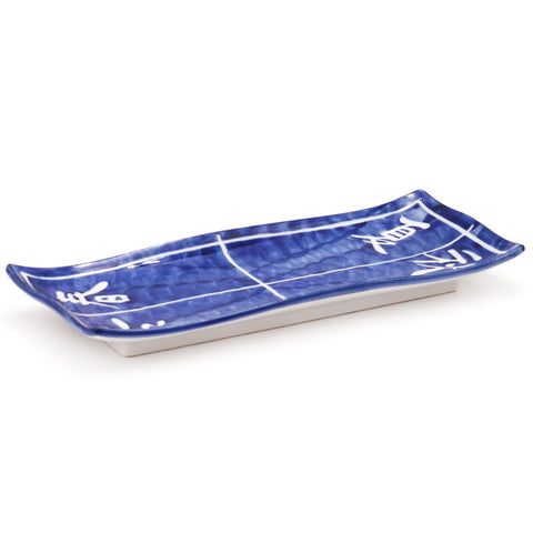 Primary presentation9-3/4" x 4" Rectangular Ceramic Plate, Blue — Chinese Characters for the Four Seasons Design
Ceramic
$14.29
View Product
Primary presentation9-3/4" x 4" Rectangular Ceramic Plate, Blue — Chinese Characters for the Four Seasons Design
Ceramic
$14.29
View Product
 Primary presentation10" Round Ceramic Dinner Plate, Beige, Pink — Sakura Design
Ceramic
$17.99
View Product
Primary presentation10" Round Ceramic Dinner Plate, Beige, Pink — Sakura Design
Ceramic
$17.99
View Product
 Contained presentationJapanese Medium Bowl - 5.85"D x 2.75"H
Ceramic
$9.99
View Product
Contained presentationJapanese Medium Bowl - 5.85"D x 2.75"H
Ceramic
$9.99
View Product
 Contained presentationRound Shallow Bowl 4.25", Blue
$4.80
View Product
Contained presentationRound Shallow Bowl 4.25", Blue
$4.80
View Product
 Primary presentation8" Round Ceramic Plate, Blue — Sakura Design
Ceramic
$9.99
View Product
Primary presentation8" Round Ceramic Plate, Blue — Sakura Design
Ceramic
$9.99
View Product
 Primary presentation5" Ceramic Plate, Green — Floral Design
Ceramic
$4.29
View Product
Primary presentation5" Ceramic Plate, Green — Floral Design
Ceramic
$4.29
View Product
 Beverage serviceJapanese Matcha Bowl , Blue Flower - 4.5"D x 3"H, 14oz
$26.99
View Product
Beverage serviceJapanese Matcha Bowl , Blue Flower - 4.5"D x 3"H, 14oz
$26.99
View Product
 Beverage serviceJapanese Matcha Bowl, Red Flower - 4.5"D x 3"H, 14oz
$24.99
View Product
Beverage serviceJapanese Matcha Bowl, Red Flower - 4.5"D x 3"H, 14oz
$24.99
View Product
Blue, green and pink repeat; strong patterned and quiet pieces have separate jobs.
High Contrast
Strongly separated colors produce energy quickly.
This works best when the product shapes, material, finish or surrounding neutral pieces provide enough continuity to keep the table from fragmenting.
 Primary presentation6’’ Black Stackable Square Plate
$3.25
View Product
Primary presentation6’’ Black Stackable Square Plate
$3.25
View Product
 Contained presentation9.5'' Round Elveated Bowl 10 Oz.
$18.75
View Product
Contained presentation9.5'' Round Elveated Bowl 10 Oz.
$18.75
View Product
 Small plate6.5" Irregular Ceramic Plate, Beige, Pink — Sakura Design
Ceramic
$7.59
View Product
Small plate6.5" Irregular Ceramic Plate, Beige, Pink — Sakura Design
Ceramic
$7.59
View Product
 Contained presentationJapanese Large Bowl - 42 fl. oz. / 8.25"D x 3.35"H
$18.99
View Product
Contained presentationJapanese Large Bowl - 42 fl. oz. / 8.25"D x 3.35"H
$18.99
View Product
 Contained presentationJapanese Shallow Bowl - 28 fl. oz. / 7"D x 2.5"H
$12.99
View Product
Contained presentationJapanese Shallow Bowl - 28 fl. oz. / 7"D x 2.5"H
$12.99
View Product
 Tea serviceWHITE TEAPOT PORCELAIN
$5.50
View Product
Tea serviceWHITE TEAPOT PORCELAIN
$5.50
View Product
Pale food-bearing fields and black supports create separation without many colors.
Curated Eclectic
Different colors, shapes, textures, patterns—and sometimes entirely different manufacturers—can work together exceptionally well.
But eclectic does not mean indiscriminate.
If the pieces vary, something important still has to repeat.
 Contained presentationJapanese Medium Bowl - 5.85"D x 2.75"H
$8.99
View Product
Contained presentationJapanese Medium Bowl - 5.85"D x 2.75"H
$8.99
View Product
 Contained presentationJapanese Medium Bowl - 18 fl. oz. / 5.85"D x 2.65"H/Titan Matte
$8.59
View Product
Contained presentationJapanese Medium Bowl - 18 fl. oz. / 5.85"D x 2.65"H/Titan Matte
$8.59
View Product
 Small plate7.5" Round Plate, Ivory, Red — Sakura Design
$9.99
View Product
Small plate7.5" Round Plate, Ivory, Red — Sakura Design
$9.99
View Product
 Rice / small bowlJapanese Rice Bowl - Flower
Ceramic
$8.59
View Product
Rice / small bowlJapanese Rice Bowl - Flower
Ceramic
$8.59
View Product
 Contained presentation5.5"Dx3"H BOWL
$5.79
View Product
Contained presentation5.5"Dx3"H BOWL
$5.79
View Product
 Primary presentation4-3/4" Square Glass Plate, Blue
Glass
$5.79
View Product
Primary presentation4-3/4" Square Glass Plate, Blue
Glass
$5.79
View Product
 Contained presentation9"D Round Salad Bowl, Blue Striped Stone
Melamine
$5.75
View Product
Contained presentation9"D Round Salad Bowl, Blue Striped Stone
Melamine
$5.75
View Product
 Primary presentationSquare Plate, White, Yellow
$19.99
View Product
Primary presentationSquare Plate, White, Yellow
$19.99
View Product
 Primary presentation4.75" Round Ceramic Plate, Orange, Blue, White
Ceramic
$4.29
View Product
Primary presentation4.75" Round Ceramic Plate, Orange, Blue, White
Ceramic
$4.29
View Product
 Contained presentationGlass Bowl — 16 fl. oz., Gold, Red
Glass
$5.79
View Product
Contained presentationGlass Bowl — 16 fl. oz., Gold, Red
Glass
$5.79
View Product
Related warm accents and blue-green fields make the differences repeatable.
05BOLD & COLORFUL / vessels
Where Should the Color Live?
Color does not need to be distributed evenly.
For many restaurants, the better decision is to concentrate expression where it has the greatest guest-facing value.
Signature Plates and Platters
Use distinctive pieces where presentation carries unusual importance:
signature entrées · tasting courses · sushi or sashimi presentation · premium shared dishes · desserts · high-margin specials
A restaurant does not need twelve colored plate formats simply because one important dish benefits from an exceptional vessel.
Signature plates and platters
 Shared presentationCeramic Rectangular Platter, Plum Blossom 12-1/4"Ceramic$97.75 current selling priceView Product
 Primary presentation9" Square Ceramic Plate, White, Blue, Brown — Arabesque DesignCeramic$18.99 current selling priceView Product
 Primary presentation10" Round Ceramic Plate, Green — Floral DesignCeramic$19.99 current selling priceView Product
 Shared presentation8.15" x 5.25" Rectangular Ceramic Plate, Green — Floral DesignCeramic$15.99 current selling priceView Product
 Primary presentation9" Round Ceramic Plate, Green — Sakura DesignCeramic$17.19 current selling priceView Product
 Primary presentation9.65" Square Ceramic Plate, Beige, Green — Oribe DesignCeramic$37.99 current selling priceView Product
 Primary presentation9-3/4" Round Ceramic Plate, Blue, White — Blue Grid Pattern DesignCeramic$7.19 current selling priceView Product
 Small plate8.25" x 5.25" Ceramic Plate — Oribe DesignCeramic$8.29 current selling priceView Product
 Shared presentation12"x5.25"x2"H Rectangle Porcelain PlatterPorcelain$27.75 current selling priceView Product
 Primary presentationRectangular Plate 11"x 4-1/2", Brown/GreenPorcelain$18.75 current selling priceView Product
Broad fields, elongated shapes and graphic surfaces change how the main presentation reads.
Bowls
Bowls are one of the strongest places to introduce color.
They occupy substantial visual area, interact directly with the food, and are often central to Asian-influenced service.
For ramen, udon, donburi, rice dishes, soups, curries, poke, shared preparations and many other menus, the bowl itself can define much of the presentation.
Color at the bowl
 Rice / small bowlRICE BOWL 4.5"Dx2.25"H (bu) 10fl.oz.$4.29 current selling priceView Product
 Contained presentationJapanese Large Bowl - 32 fl. oz. / 6.25"D x 3.25"H$12.99 current selling priceView Product
 Shared presentationJapanese Large Bowl-10 fl. oz. / 8.25"D x 3.15"H$23.99 current selling priceView Product
 Contained presentationJapanese Medium Bowl - Carp/Wave$8.59 current selling priceView Product
 Contained presentationJapanese Medium Bowl - 5.85"D x 2.75"HCeramic$8.99 current selling priceView Product
 Contained presentationJapanese Medium Bowl - 5.85"D x 2.75"HCeramic$8.59 current selling priceView Product
 Contained presentationJapanese Medium Bowl - 5.85"D x 2.75"HCeramic$8.59 current selling priceView Product
 Contained presentationJapanese Medium Bowl - 5.85"D x 2.75"HCeramic$8.59 current selling priceView Product
 Contained presentationJapanese Medium Bowl - 5.85"D x 2.75"HCeramic$9.99 current selling priceView Product
 Contained presentationJapanese Large Bowl - 34 fl. oz. / 7.5"D x 3"H$11.49 current selling priceView Product
 Contained presentationJapanese Large Bowl - 34 fl. oz. / 7.5"D x 3"H$11.49 current selling priceView Product
 Contained presentationJapanese Large Bowl - 34 fl. oz. / 7.5"D x 3"H$11.49 current selling priceView Product
 Contained presentationJapanese Large Bowl - 34 fl. oz. / 7.5"D x 3"H$11.49 current selling priceView Product
 Contained presentationJapanese Large Bowl - 34 fl. oz. / 7.5"D x 3"H$11.49 current selling priceView Product
 Noodle / meal bowlJapanese Noodle Bowl - 34 fl. oz. / 7"D x 3.5"H$14.99 current selling priceView Product
Rice, soup, noodle and shallow forms offer different amounts of visible interior and wall.
Small Dishes
Small dishes provide unusually high visual leverage at relatively low commitment.
Sauce dishes, banchan dishes, appetizer plates, condiment pieces and other smaller formats can introduce strong color or pattern without forcing the main vessels to carry the entire visual burden.
They also allow a table to accumulate color naturally as service progresses.
Smallware with visual leverage
 Sauce / small dishRectangular Sauce Plate 3-1/2", Sky BluePorcelain$3.45 current selling priceView Product
 Primary presentation3.5" x 2.5" Rectangular Ceramic Plate, Green — Floral DesignCeramic$5.79 current selling priceView Product
 Primary presentation3.75" Ceramic Plate, White, Blue — Crab DesignCeramic$4.29 current selling priceView Product
 Primary presentation3.75" Ceramic Plate, White, Blue — Flatfish DesignCeramic$4.29 current selling priceView Product
 Primary presentation3.75" Ceramic Plate, White, Blue — Blowfish DesignCeramic$4.29 current selling priceView Product
 Primary presentation3.5" Ceramic Plate, Blue — Apricot Blossom DesignCeramic$4.29 current selling priceView Product
 Primary presentation5" Square Ceramic Plate, Blue — Arabesque DesignCeramic$7.19 current selling priceView Product
 Rice / small bowl4"D x 1.5"H BOWL (pk)$5.79 current selling priceView Product
 Contained presentation3.5"Dx1.5"H BOWL$5.79 current selling priceView Product
 Contained presentationPl. Bowl M 16cm x 47cm 18.5"Plastic$14.25 current selling priceView Product
 Sauce / small dishRound Sauce bowl 3.5"Dx1.75"H$2.90 current selling priceView Product
 Sauce / small dishMelamine Flower Saucer 3"D, Plum BlossomMelamine$1.75 current selling priceView Product
Small repeatable pieces distribute color without giving every main vessel a busy surface.
Shared Serving Pieces
A large platter, bowl or serving vessel can become the visual anchor of an entire table.
This is particularly effective in restaurants built around sharing.
Shared-food ware with a real footprint
 Shared presentationRectangular Platter 18.5", Light Blue/BlackPorcelain$23.50 current selling priceView Product
 Small plate10.5"X6.5"X1.5"H Rectangular Porcelain Plate Deep, Reactive Glaze - Blue/BlackPorcelain$9.95 current selling priceView Product
 Shared presentation15"X5" Rectangular Porcelain Platter, Reactive Glaze - Blue/BlackPorcelain$17.25 current selling priceView Product
 Shared presentation12.75 x 4.75" Rectangular Stoneware Platter SeaStone$13.25 current selling priceView Product
 Shared presentationRectangular Platter 18.5", White SakuraPorcelain$23.50 current selling priceView Product
 Shared presentationRectangular Platter 20"x6", Pearl Elegant$17.25 current selling priceView Product
 Shared presentationClear Blue Streak Plastic Rectangular Platter 14"x10"Plastic$37.50 current selling priceView Product
 Shared presentationLacquer Round Platter 17-3/4"$66.75 current selling priceView Product
 Shared presentationLacquer Round Platter 13-1/8", Blue/Brown$39.95 current selling priceView Product
 Shared presentationLacquer Round Platter 15-1/2", Blue/Brown$50.45 current selling priceView Product
 Shared presentation18"x6-1/2" Rectangular Plate Sunflower, White CeramicCeramic$13.50 current selling priceView Product
 Primary presentation15-1/2" Bamboo Plate, White CeramicCeramic$10.95 current selling priceView Product
Long platters, broad round presentations and sculptural serving shapes do different table jobs.
Beverage, Tea and Sake Service
Color introduced through beverage service can change the table without changing the food vessels at all.
This is especially useful where the food presentation benefits from quieter plates and bowls.
Sake and tea carry their own visual identity
 Sake serviceSake Bottle 5"H, Blue Flower$2.75 current selling priceView Product
 Sake serviceSake Bottle (6)$11.00 current selling priceView Product
 Sake servicePlastic Sake Bottle Green Bamboo 13ozPlastic$9.25 current selling priceView Product
 Sake servicePorcelain Sake Bottle 6.25"Hx2.75"D - 10 Oz, Chun Tenmoku - Blue/Dark BrownPorcelain$7.95 current selling priceView Product
 Sake servicePorcelain Sake Bottle 6.25"Hx2.75"D - 10 Oz, Half-Glazed - Blue/BlackPorcelain$7.25 current selling priceView Product
 Sake cupPorcelain Sake Cup 2"Dx1.5"H - 2 Oz, Chun Tenmoku - Blue/Dark BrownPorcelain$2.75 current selling priceView Product
 Sake servicePorcelain Sake Bottle 6.25"Hx2.75"D - 10 Oz, Black/RedPorcelain$7.25 current selling priceView Product
 Sake cupPorcelain Sake Cup 2"Dx1.5"H - 2 Oz, Half-Glazed - Black/GrayPorcelain$2.30 current selling priceView Product
 Sake servicePorcelain Sake Bottle 6.25"Hx2.75"D - 10 Oz, Half-Glazed - Black / GrayPorcelain$7.25 current selling priceView Product
 Sake serviceGlass Sake Bottle Light Blue Dots - 3.5"D x 5"H / 12.7cm$14.99 current selling priceView Product
 Sake serviceSake Pot Piece 5"H (bl)$2.89 current selling priceView Product
 Complete sake serviceSake Set 1:4 - 12 fl.oz.Sold as the listed set$19.99 current selling priceView Product
 Complete sake serviceSake Set 1:4 12 fl.oz. (plum tree)Sold as the listed set$21.99 current selling priceView Product
 Complete sake service1:4 Sake SetSold as the listed set$19.99 current selling priceView Product
Bottles, cups and complete services can introduce color independently of main dinnerware.
06BOLD & COLORFUL / food
Choose the Tableware Around the Food
There is no universally correct restaurant plate color.
Plate color, food color, pattern, lighting, plating arrangement and restaurant context interact. The same vessel can improve one dish and weaken another.
The practical question is simpler:
Does the vessel make the food easier to read, more deliberate, and more valuable-looking—or does it compete with it?
Highly Colorful Food
When the food already carries substantial visual information, the plate needs a reason to add more.
Strong color can still work, but the relationship should be intentional. Quiet solids, controlled rims and selective contrast often give colorful ingredients more room.
For highly colorful food
 Primary presentationSquare Plate 7", Pearl Elegant$8.25 current selling priceView Product
 Small plateRectangular Plate 7.25"x4.75", Pearl Elegant$6.25 current selling priceView Product
Quiet fields keep the food legible.
Visually Restrained Food
Monochromatic dishes can tolerate—and sometimes benefit from—much stronger vessel color or pattern because the tableware provides visual separation the food itself does not.
For restrained food
 Small plate6.85" Round Ceramic Plate, Dark Brown, TurquoiseCeramic$7.19 current selling priceView Product
 Primary presentation9.5" Round Ceramic Plate, Dark Brown, TurquoiseCeramic$21.99 current selling priceView Product
Turquoise interiors give pale compositions stronger separation.
Sauce-Heavy Dishes
Consider how the sauce reads against the surface and whether the rim, well and usable plating area still present cleanly after service begins.
For sauce-heavy dishes
 Rice / small bowl4.5’’ Bowl Fire Earth 10 Oz.$4.00 current selling priceView Product
 Contained presentationRound Shallow Bowl 9.25", Blue/Grey$17.75 current selling priceView Product
Contained forms deserve testing with the actual sauce and portion.
Broth and Noodle Dishes
The bowl dominates the presentation. Interior color, rim width, bowl depth and exterior finish can matter more than the plate color decisions relevant to flatware.
For broth and noodles
 Contained presentationJapanese Noode Bowl Sakura Garden - 28 fl. oz. / 7.5"D x 3"H$12.59 current selling priceView Product
 Noodle / meal bowlJapanese Noodle Bowl - 30 fl. oz. / 6.65"D x 3.5"H$17.19 current selling priceView Product
Compare portion fit, opening and handling on samples; nominal capacity is not working capacity.
Sushi and Sashimi
The vessel needs enough visual authority to frame the composition without becoming more complicated than the food.
For sushi and sashimi
 Primary presentation12.25"X4.75" Rectangular Porcelain Plate W/Divider, Matte BlackPorcelain$9.50 current selling priceView Product
 Primary presentation9.65" Square Ceramic Plate, Gray, TurquoiseCeramic$37.99 current selling priceView Product
A long dark field and a pale square offer two different presentation geometries.
Signature Dishes
If one menu item carries unusual brand, margin or photographic value, specify the vessel for that dish rather than forcing it onto the general-purpose dinnerware program.
For signature dishes
 Primary presentationRectangular Plate 11"x 4-1/2", Brown/WhitePorcelain$18.00 current selling priceView Product
 Primary presentation8.9" Triangular Ceramic Plate, OrangeCeramic$7.19 current selling priceView Product
Distinctive geometry and concentrated color work only when the dish earns them.
07BOLD & COLORFUL / surfaces
How Visually Active Should the Surface Be?
Color intensity and surface activity are not the same thing.
A saturated solid blue plate can be quieter than a pale plate covered in a complex pattern.
Solid Color
The cleanest way to introduce strong color.
It puts most of the visual emphasis on the relationship between the food and the hue rather than on surface decoration.


Rim or Localized Decoration
Color stays concentrated at the edge or in selected areas.
This can preserve a quieter food canvas while still giving the table a recognizable identity.


Speckled and Textured Finishes
Speckling and restrained surface variation add depth without necessarily becoming the dominant visual element.
Speckled and textured fields
 Primary presentation11.25’’ Coupe Plate Fire Earth$10.50 current selling priceView Product
 Contained presentationCeramic Bowl — 16 fl. oz., RedCeramic$6.79 current selling priceView Product
Subtle surface variation carries less visual activity than a dense motif.
Tonal and Reactive Glazes
Reactive finishes introduce deliberate piece-to-piece variation and more pronounced surface character.
Use them because the variation itself belongs in the restaurant—not because “handmade” is automatically better.
Tonal surface
 Contained presentation9 x 6.75" Oval Elveated Stoneware Bowl - 12 Oz.$12.25 current selling priceView Product
 Contained presentation7.5 x 5.5" Oval Elveated Stoneware Bowl - 8 Oz.$9.75 current selling priceView Product
Related dark and light areas add depth without graphic repetition.
Patterned and Graphic Surfaces
Pattern can become as visually important as the underlying color.
Use it accordingly.
Highly expressive pattern usually needs quieter supporting pieces unless the entire restaurant is deliberately operating at a higher level of visual complexity.
Pattern and graphic line
 Small plate5-1/2" Round Plate, Blue, Red$2.89 current selling priceView Product
 Contained presentationJapanese Large Bowl - 34 fl. oz. / 7.5"D x 3"H$11.49 current selling priceView Product
Vary the density of graphic marks, not just the hue.
Highly graphic / multicolor
 Primary presentation6" Melamine Round Plate, PeacockMelamine$3.50 current selling priceView Product
 Contained presentation5"Dx2.25"H ASSTD BOWL$9.99 current selling priceView Product
A dense patterned field needs quieter support.
08BOLD & COLORFUL / coordination
How to Mix Colorful Tableware Without Making It Look Random
Restaurants do not need matching dinnerware.
They need enough repetition that the differences look deliberate.
Repeat Something Important
If the colors vary, repeat the shape.
If the shapes vary, repeat a color family.
If both vary, keep the material, glaze language, decorative character or formality consistent enough to hold the table together.
The rule does not need to be complicated.
It needs to be visible.
Decide Which Pieces Carry the Table
Some pieces should establish the direction.
Others should support them.
A few can deliberately break the pattern.
If every product is selected to be the most interesting object on the table, nothing is actually emphasized.
Pattern Needs Space
Strong patterned pieces work best when surrounding pieces allow the pattern to register.
Pattern against pattern can be excellent when the relationship is deliberate. It is poor when the only reason the pieces coexist is that both looked good independently.
Use Neutral Pieces Deliberately
White, cream, black, stainless, clear glass and other quieter materials are useful inside a colorful tabletop.
They create contrast and visual breathing room.
Neutral does not mean unfinished.
Keep the Level of Formality Coherent
Color compatibility does not rescue pieces that belong to completely different restaurant experiences.
A highly refined thin porcelain course plate and a heavy rustic bowl may technically share a hue and still feel wrong together.
Control SKU Proliferation
Visual variety and purchasing complexity are different things.
One bowl purchased in four colors is four SKUs.
Repeat the same approach across a large tabletop package and replenishment becomes substantially more complicated.
Use variation where the guest sees it.
Standardize where standardization helps the operation.
SIX COMPOSITIONS / SIX REPEATABLE RELATIONSHIPS
 Contained presentationJapanese Medium Bowl - 10 fl. oz. / 4.5"D x 2.5"H
$7.59
View Product
Contained presentationJapanese Medium Bowl - 10 fl. oz. / 4.5"D x 2.5"H
$7.59
View Product
 Contained presentationJapanese Medium Bowl - 10 fl. oz. / 4.5"D x 2.5"H
$8.59
View Product
Contained presentationJapanese Medium Bowl - 10 fl. oz. / 4.5"D x 2.5"H
$8.59
View Product
 Contained presentationJapanese Large Bowl - 33 fl. oz. / 6.25"D x 3.35"H/Titan Matte
$12.99
View Product
Contained presentationJapanese Large Bowl - 33 fl. oz. / 6.25"D x 3.35"H/Titan Matte
$12.99
View Product
 Contained presentationJapanese Large Bowl - 33 fl. oz. / 6.25"D x 3.35"H
Ceramic
$12.99
View Product
Contained presentationJapanese Large Bowl - 33 fl. oz. / 6.25"D x 3.35"H
Ceramic
$12.99
View Product
Two repeated bowl geometries change green-blue tones while retaining a recognizable shape vocabulary.
 Small plate5.25" Ceramic Plate, Green — Floral Design
Ceramic
$9.99
View Product
Small plate5.25" Ceramic Plate, Green — Floral Design
Ceramic
$9.99
View Product
 Small plate5.35" Round Ceramic Plate, White, Green — Floral Design
Ceramic
$4.29
View Product
Small plate5.35" Round Ceramic Plate, White, Green — Floral Design
Ceramic
$4.29
View Product
 Contained presentationJapanese Medium Bowl - 18 fl. oz. / 5.85"D x 2.65"H
$8.99
View Product
Contained presentationJapanese Medium Bowl - 18 fl. oz. / 5.85"D x 2.65"H
$8.99
View Product
 Rice / small bowl5-1/4"Dx2-1/2"H RICE BOWL PC RD
$11.49
View Product
Rice / small bowl5-1/4"Dx2-1/2"H RICE BOWL PC RD
$11.49
View Product
Green and pale interiors connect rectangular, round and deeper food-bearing forms.
 Primary presentation8" Round Ceramic Plate, Blue — Arabesque Design
Ceramic
$11.49
View Product
Primary presentation8" Round Ceramic Plate, Blue — Arabesque Design
Ceramic
$11.49
View Product
 Noodle / meal bowlNoodle Bowl - Japanese Plum (ume) Blossoms
$18.99
View Product
Noodle / meal bowlNoodle Bowl - Japanese Plum (ume) Blossoms
$18.99
View Product
 Shared presentation17-1/2"x3-1/2" Bamboo Platter, White Ceramic
Ceramic
$12.25
View Product
Shared presentation17-1/2"x3-1/2" Bamboo Platter, White Ceramic
Ceramic
$12.25
View Product
 Contained presentationBOWL (RG) 7oz 4"Dx2"H CAC RED GATE
Porcelain
$1.75
View Product
Contained presentationBOWL (RG) 7oz 4"Dx2"H CAC RED GATE
Porcelain
$1.75
View Product
Graphic blue and localized branches share the table with quiet white supporting ware.
 Primary presentation8’’ Coupe Plate Splash Blanch
$4.75
View Product
Primary presentation8’’ Coupe Plate Splash Blanch
$4.75
View Product
 Primary presentation10.5’’ Deep Coupe Plate Splash Blanch
$9.95
View Product
Primary presentation10.5’’ Deep Coupe Plate Splash Blanch
$9.95
View Product
 Primary presentation10’’ Black Stackable Square Plate
$7.95
View Product
Primary presentation10’’ Black Stackable Square Plate
$7.95
View Product
 Primary presentation10.85" x 10.5" Irregular Ceramic Plate, Turquoise, Aqua
Ceramic
$52.99
View Product
Primary presentation10.85" x 10.5" Irregular Ceramic Plate, Turquoise, Aqua
Ceramic
$52.99
View Product
Cream and dark rectangular supports leave the turquoise main vessel in charge.
 Primary presentation4.75" Ceramic Plate, Blue — Fubuki Tokusa Design
Ceramic
$6.59
View Product
Primary presentation4.75" Ceramic Plate, Blue — Fubuki Tokusa Design
Ceramic
$6.59
View Product
 Contained presentationJapanese Shallow Bowl - 10 fl. oz. / 5.35"L x 5.25"W x 2"H
$7.19
View Product
Contained presentationJapanese Shallow Bowl - 10 fl. oz. / 5.35"L x 5.25"W x 2"H
$7.19
View Product
 Complete sake serviceJapanese Long Grass Sake Cup Set- 5pcs
Sold as the listed set
$10.75
View Product
Complete sake serviceJapanese Long Grass Sake Cup Set- 5pcs
Sold as the listed set
$10.75
View Product
 Service utensilMelamine Soup Spoon 5-1/2", Bamboo
Melamine
$0.90
View Product
Service utensilMelamine Soup Spoon 5-1/2", Bamboo
Melamine
$0.90
View Product
Blue marks recur on plate, bowl, sake cups and spoon without forcing one series.
 Primary presentation9" Round Ceramic Dinner Plate, Green, Brown — Sakura Design
Ceramic
$15.99
View Product
Primary presentation9" Round Ceramic Dinner Plate, Green, Brown — Sakura Design
Ceramic
$15.99
View Product
 Small plate6.65" Ceramic Deep Plate, Beige, Pink — Sakura Design
Ceramic
$7.59
View Product
Small plate6.65" Ceramic Deep Plate, Beige, Pink — Sakura Design
Ceramic
$7.59
View Product
 Contained presentation8"Dx1.75"H BOWL
$8.59
View Product
Contained presentation8"Dx1.75"H BOWL
$8.59
View Product
 Contained presentationBOWL BLUE LOTUS 7-1/4"Dx3"H 36oz
Ceramic
$8.35
View Product
Contained presentationBOWL BLUE LOTUS 7-1/4"Dx3"H 36oz
Ceramic
$8.35
View Product
Floral and blue motifs recur around related pale backgrounds; shapes serve different foods.
09BOLD & COLORFUL / applications
Where Bold & Colorful Works Best
Color is not limited to one cuisine or price level.
It is strongest where the tabletop is expected to contribute visibly to the restaurant experience.
Small Plates and Sharing
A table containing many dishes benefits from intentional variation because the service itself creates a changing visual composition.
Color can help differentiate vessel types and keep a large spread from becoming visually flat.
Small plates / social dining
 Primary presentation4.75" Square Ceramic Plate, Emerald, Blue — Aangelfish DesignCeramic$7.19 current selling priceView Product
 Service utensilJapanese Medium Bowl - Sakura 6.5"Dx2.5"H, Irregular ShapeCeramic$12.99 current selling priceView Product
 Primary presentation8.75"X5" Rectangular Porcelain Plate, BlackPorcelain$6.50 current selling priceView Product
 Primary presentationStony Round Plate 9-1/2", Blue/BrownPorcelain$12.50 current selling priceView Product
 Contained presentationMelamine Round Side Dish Bowl 4-1/2", Rain FlowerMelamine$2.25 current selling priceView Product
Different small-food formats are connected by blue-green and dark fields.
Asian-Fusion and Pan-Asian Restaurants
Menus drawing from multiple service traditions naturally create opportunities to combine bowls, plates, smallware and serving pieces across different shapes and materials.
The challenge is not finding variety.
It is controlling it.
Pan-Asian / mixed-menu applications
 Primary presentationLacquer Plate, RedLacquer$8.59 current selling priceView Product
 Contained presentationTurquoise Blue Japanese Oval Large Bowl - 9.65"L x 8"W x 3.65"H$55.99 current selling priceView Product
 Contained presentationJapanese Medium Bowl - Sakura 5.5"Dx2"H, Irregular ShapeCeramic$8.29 current selling priceView Product
 Sauce / small dishMelamine Round Sauce Dish 3-1/4", Autumn GrassMelamine$1.00 current selling priceView Product
 Primary presentationHARIO Straght Glass Jug 1000ml, RedGlass, Plastic, Silicone$21.00 current selling priceView Product
Broad, contained and shared service stay functionally distinct; warm accents repeat.
Japanese and Korean Casual Concepts
Color can be concentrated in bowls, small dishes, sideware, sake or tea service, banchan dishes and specialty serving pieces while major vessels remain more restrained.
Bars and Social Dining
High-energy dining environments can absorb more contrast, pattern and unusual drinkware than concepts built around quieter formal presentation.
Cafés and Brunch
Color can do considerable brand work where the menu, room and beverage service already lean visually expressive.
Patio, Resort and Outdoor Dining
Stronger color often reads naturally in high-light, social environments where a completely restrained tabletop can disappear.
Explore Asian Fusion / Pan-Asian Tableware
10BOLD & COLORFUL / investment
Where Should You Spend for Visual Impact?
Higher tabletop spend is not automatically better.
Spend where the additional investment is visible and useful.
Keep Workhorse Pieces Commercial
High-use foundation pieces need to perform.
Durability, range depth, replacement availability, cost and handling matter more here than decorative complexity.
Dependable foundation candidates
 Primary presentationMelamine Round Plate 11-1/2", BambooMelamine$7.05 current selling priceView Product
 Contained presentationMelamine Round Bowl 9-1/2", BambooMelamine$10.75 current selling priceView Product
 Sauce / small dishMelamine Round Sauce Dish 3-1/4", BambooMelamine$0.99 current selling priceView Product
Range depth and useful roles matter before visual complexity.
Upgrade the Pieces Guests Notice
Spend more aggressively where the vessel materially changes the presentation:
signature entrée plates · noodle bowls · sashimi or sushi presentation · shared platters · dessert ware · tasting-course pieces · beverage service
Upgrade where guests notice
 Small plate6.25" Round Ceramic Plate, Navy, Blue — Dragonfly DesignCeramic$8.59 current selling priceView Product
 Rice / small bowl4"Dx2"H BOWL w/lid$5.79 current selling priceView Product
 Primary presentation8.75" Square Plate, Black, Red$27.19 current selling priceView Product
Give more differentiation to a selected food-bearing field or lidded presentation.
Use Small Pieces for Efficient Visual Change
Colorful small dishes, sideware, cups and serving pieces can create substantial visual identity without replacing every plate and bowl.
Premium Tableware Should Earn Its Place
Higher cost is justified when the product meaningfully improves:
presentation · restaurant identity · material quality · finish · form · service experience · durability · sourcing value
not because it happens to be the most expensive version available.
Selective statement candidates
 Primary presentation11.2" Triangular Textured Glass Plate, ClearTextured Glass$7.19 current selling priceView Product
 Small plate10.5" x 6.65" Rectangular Ceramic Plate, TurquoiseCeramic$38.99 current selling priceView Product
 Contained presentationRound Bowl 6.75", Brown Flower$2.00 current selling priceView Product
Glass geometry, turquoise irregular form and sculptural brown surface earn different roles.
11BOLD & COLORFUL / operation
Before You Buy: Make Sure the Tabletop Can Survive the Restaurant
The opening photograph is not the test.
The test is whether the assortment still works after months and years of washing, stacking, breaking, replenishing and adding locations.
Check the Range, Not Just the Hero Piece
A beautiful plate does not make a complete dinnerware program.
Confirm that the family contains the menu-relevant bowls, small plates, serving pieces, sizes and shapes the restaurant actually needs.
Some collections should anchor most of the tabletop.
Others are better used as supporting or statement families.
Know which one you are buying.
Check Commercial Performance
Evaluate the requirements that matter to the operation:
material · commercial warewashing · thermal requirements where relevant · chip exposure · decoration durability · weight · handling · stackability · storage · case packs · replacement availability
Do not accept a weaker operating product merely because the color is attractive.
Check the Stack
Mixing dinnerware visually does not mean every product needs to share one physical stack.
Different shapes and manufacturers can coexist beautifully on the table and perform poorly together in storage or the dishroom.
Test them.
Count the SKUs
Every additional color, size and shape becomes another item someone eventually has to purchase, inventory and replace.
That complexity can be completely justified.
It should simply be intentional.
Decide Whether You Need Exact Matching
Some restaurant brands depend on highly controlled color consistency.
Others are stronger when slight variation is expected.
Those two operations should not use the same replacement strategy.
Plan Replacements Before Opening
Identify which pieces must remain exact, which can accept coordinated substitutions, and which are deliberately flexible.
The best replacement decision is the one made before the first piece breaks.
Investigate the Assortment Behind the Hero Piece
These are current range and role comparisons. Confirm project quantities, lot consistency, case units, warewashing requirements and replacement plans before specification; a live listing is not a supply commitment.
Bamboo melamine: a broad listed range
 Primary presentationMelamine Rectangular Plate 6-5/8"x4-1/2", BambooMelamine$4.98 current selling priceView Product
 Noodle / meal bowlMelamine Round Udon Bowl 8"D, BambooMelamine$6.99 current selling priceView Product
 Contained presentationMelamine Round Bowl 4-7/8", BambooMelamine$2.90 current selling priceView Product
Plates, noodle bowls and smaller bowls demonstrate current range breadth.
Plum-blossom ceramics: supporting bowl range
 Contained presentationBowl - Japanese Plum (ume) BlossomsCeramic$9.99 current selling priceView Product
 Contained presentationJapanese Plum (ume) Blossoms Medium Bowl 5"Dx3"H$11.49 current selling priceView Product
 Noodle / meal bowlNoodle Bowl - Japanese Plum (ume) Blossoms$12.99 current selling priceView Product
Small, medium and noodle forms share a related visual language.
Distinctive presentations: statement roles
 Small plateTriangular Plate 6.25", Brown$11.05 current selling priceView Product
 Contained presentation7.5’’ Bowl Earth 16 Oz.$10.45 current selling priceView Product
 Shared presentation12.75"X6.25" Rectangular Porcelain Platter, BlackPorcelain$11.75 current selling priceView Product
Form and surface differentiate a course; do not assume an entire system from a hero piece.
Splash Blanch: recurring foundation forms
 Primary presentation9’’ Coupe Plate Splash Blanch$5.50 current selling priceView Product
 Contained presentation11’’ Wide Rim Pasta Bowl Splash Blanch 14 Oz.$13.75 current selling priceView Product
 Primary presentation10’’ Round Stackable Plate Splash Blanch$8.50 current selling priceView Product
A quiet palette spans coupe, pasta and deep serving forms.
Related glaze: compare actual samples
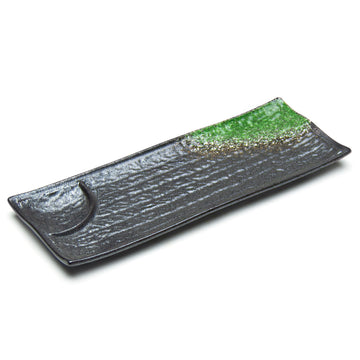 Primary presentation12.25"X4.75" Rectangular Porcelain Plate W/Divider, Black/GreenPorcelain$9.50 current selling priceView Product
 Shared presentation13.25"X4"X1.25"H Rectangular Porcelain Platter, Black/GreenPorcelain$9.25 current selling priceView Product
 Noodle / meal bowl8.25"Dx3.5"H Porcelain Noodle Bowl, Black/GreenPorcelain$9.25 current selling priceView Product
Rectangular and bowl forms share a color relationship; verify acceptable variation.
Gold Orchid: patterned melamine support
 Primary presentation8-1/4" Melamine Round Plate Gold OrchidMelamine$10.25 current selling priceView Product
 Sauce / small dish4-1/4" Melamine Round Tempura Sauce Bowl, Gold OrchidMelamine$6.95 current selling priceView Product
 Sauce / small dish3-1/4" Melamine Round Sauce Bowl, Gold OrchidMelamine$3.00 current selling priceView Product
Repeated motif across plate, tempura bowl and small sauce bowl.
Selective ceramic upgrade candidates
 Primary presentation6-2/3" Round Porcelain Plate, White, Blue — Floral DesignPorcelain$2.89 current selling priceView Product
 Primary presentation8.5" x 7" Oval Ceramic Plate, Turquoise, GreenCeramic$22.99 current selling priceView Product
 Noodle / meal bowlNoodle Bowl - Japanese Plum (ume) BlossomsCeramic$19.99 current selling priceView Product
Compare handling and presentation for each role; price is not a performance guarantee.
12BOLD & COLORFUL / tabletops
Complete Bold & Colorful Restaurant Tabletops
A complete tabletop should not look as though every product was chosen separately.
The pieces should reinforce one another while still giving the menu enough range to present different foods properly.
ERS builds the assortment around the restaurant rather than forcing the restaurant into one dinnerware collection.
Ten restaurant specifications, with every component individually actionable. Prices are current Shopify selling prices, not a bundled quotation or a normalized per-piece budget. Confirm selling units and project supply before ordering.
Neutral Foundation + Color Accents
 Main plate10.75’’ Coupe Plate Splash Blanch
$8.45
View Product
Main plate10.75’’ Coupe Plate Splash Blanch
$8.45
View Product
 Shared bowl8.25’’ Round Bowl Splash Blanch 40 Oz.
$6.75
View Product
Shared bowl8.25’’ Round Bowl Splash Blanch 40 Oz.
$6.75
View Product
 Side plate6.25’’ Coupe Plate Splash Blanch
$3.75
View Product
Side plate6.25’’ Coupe Plate Splash Blanch
$3.75
View Product
 Shared rectangular plate11 x 7’’ Rectangular Plate Splash Blanch
$7.95
View Product
Shared rectangular plate11 x 7’’ Rectangular Plate Splash Blanch
$7.95
View Product
 Support / small-food plate11 x 5.25’’ Black Stackable Rectangular Plate
$7.95
View Product
Support / small-food plate11 x 5.25’’ Black Stackable Rectangular Plate
$7.95
View Product
 Sauce / small dish3.5"Dx1"H Porcelain Bowl Shallow, Black Oribe
Porcelain
$2.00
View Product
Sauce / small dish3.5"Dx1"H Porcelain Bowl Shallow, Black Oribe
Porcelain
$2.00
View Product
 MugMug Splash Blanch 12 Oz.
$3.35
View Product
MugMug Splash Blanch 12 Oz.
$3.35
View Product
 Chopsticks with caseWooden Chopstick w/ Case, Red
$2.95
View Product
Chopsticks with caseWooden Chopstick w/ Case, Red
$2.95
View Product
 Color anchor / shared plate11" x 4.75" Rectangular Ceramic Plate, Turquoise
Ceramic
$24.99
View Product
Color anchor / shared plate11" x 4.75" Rectangular Ceramic Plate, Turquoise
Ceramic
$24.99
View Product
Cream mains and bowls carry repeat service; a turquoise shared vessel and red-handled utensil carry selected emphasis. Fits mixed-menu casual dining; repeat the core forms and sample the mixed-material handling.
Signature Red / Black
 Main plate9.25" Round Ceramic Plate, Black, Red
Ceramic
$17.19
View Product
Main plate9.25" Round Ceramic Plate, Black, Red
Ceramic
$17.19
View Product
 Shared platterRectangular Platter 18.5", Black
Porcelain
$23.50
View Product
Shared platterRectangular Platter 18.5", Black
Porcelain
$23.50
View Product
 Rice bowlCeramic Rice Bowl — 9 fl. oz., Red
Ceramic
$3.99
View Product
Rice bowlCeramic Rice Bowl — 9 fl. oz., Red
Ceramic
$3.99
View Product
 Meal bowlCeramic Bowl — 35 fl. oz., Red
Ceramic
$7.19
View Product
Meal bowlCeramic Bowl — 35 fl. oz., Red
Ceramic
$7.19
View Product
 Sauce dishMelamine Rectangular Sauce Dish 3-5/8"x2-1/2", Black/Red
Melamine
$1.60
View Product
Sauce dishMelamine Rectangular Sauce Dish 3-5/8"x2-1/2", Black/Red
Melamine
$1.60
View Product
 Small condiment dishMelamine Round Sauce Dish 4", Black/Red
Melamine
$1.50
View Product
Small condiment dishMelamine Round Sauce Dish 4", Black/Red
Melamine
$1.50
View Product
 Compartmented serving plateBlack & Red Lacquer 3-in-1 Serving Plate
$17.19
View Product
Compartmented serving plateBlack & Red Lacquer 3-in-1 Serving Plate
$17.19
View Product
 Tea cupMelamine Teacup 3"H, Black/Red
Melamine
$2.25
View Product
Tea cupMelamine Teacup 3"H, Black/Red
Melamine
$2.25
View Product
 Soup spoonMelamine Soup Spoon 5-1/2", Black/Red
Melamine
$0.90
View Product
Soup spoonMelamine Soup Spoon 5-1/2", Black/Red
Melamine
$0.90
View Product
Red food-bearing fields recur against black supports. Bowls, dishes, serving compartments and tea cover casual Japanese mains and shared sides; keep a few recurring geometries rather than a separate shape per dish.
Tonal Blue / Dark Edge
 Main plate10"Dx1.5"H Round Porcelain Plate, Reactive Glaze - Blue/Black
Porcelain
$13.95
View Product
Main plate10"Dx1.5"H Round Porcelain Plate, Reactive Glaze - Blue/Black
Porcelain
$13.95
View Product
 Primary noodle bowlRamen Bowl — 43 fl. oz., Black, Blue
43 fl. oz. catalog capacity; 9 in D × 3.75 in H
Sample at the finished serving fill; catalog capacity is not working capacity.
$8.59
View Product
Primary noodle bowlRamen Bowl — 43 fl. oz., Black, Blue
43 fl. oz. catalog capacity; 9 in D × 3.75 in H
Sample at the finished serving fill; catalog capacity is not working capacity.
$8.59
View Product
 Shared platter15"X5" Rectangular Porcelain Platter, Black/Green
Porcelain
$17.25
View Product
Shared platter15"X5" Rectangular Porcelain Platter, Black/Green
Porcelain
$17.25
View Product
 Rice bowl4.25"Dx2.5"H Porcelain Rice Bowl, Reactive Glaze - Blue/Black
Porcelain
$3.25
View Product
Rice bowl4.25"Dx2.5"H Porcelain Rice Bowl, Reactive Glaze - Blue/Black
Porcelain
$3.25
View Product
 Small plate8.75"X5" Rectangular Porcelain Plate, Reactive Glaze - Blue/Black
Porcelain
$6.50
View Product
Small plate8.75"X5" Rectangular Porcelain Plate, Reactive Glaze - Blue/Black
Porcelain
$6.50
View Product
 Small / composed bowlTurquoise Glazed Japanese Bowl 5"Dx3"H BOWL
$17.19
View Product
Small / composed bowlTurquoise Glazed Japanese Bowl 5"Dx3"H BOWL
$17.19
View Product
 Soup spoon5.75"L Porcelain Soup Spoon, Reactive Glaze - Blue/Black
Porcelain
$1.75
View Product
Soup spoon5.75"L Porcelain Soup Spoon, Reactive Glaze - Blue/Black
Porcelain
$1.75
View Product
 Tea cupPorcelain Teacup 3"Dx3.5"H, Reactive Glaze - Blue/Black
Porcelain
$3.45
View Product
Tea cupPorcelain Teacup 3"Dx3.5"H, Reactive Glaze - Blue/Black
Porcelain
$3.45
View Product
 Course / presentation plate13.25"X4"X1.25"H Rectangular Porcelain Platter, Reactive Glaze - Blue/Black
Porcelain
$9.25
View Product
Course / presentation plate13.25"X4"X1.25"H Rectangular Porcelain Platter, Reactive Glaze - Blue/Black
Porcelain
$9.25
View Product
 MugStackable Black Mug 11 Oz.
$3.95
View Product
MugStackable Black Mug 11 Oz.
$3.95
View Product
Blue-green interiors and dark boundaries repeat across main, shared, rice, small-bowl, utensil and beverage roles. Fits noodles and composed Japanese service; recurring bowl forms carry depth while the long plate carries breadth.
Blue, Green & Warm Neutral
 Main plateJapanese Medium Bowl - 5.85"D x 2.75"H
Ceramic
$8.59
View Product
Main plateJapanese Medium Bowl - 5.85"D x 2.75"H
Ceramic
$8.59
View Product
 Side plate6.5" Ceramic Plate, Blue — Fubuki Tokusa Design
Ceramic
$7.19
View Product
Side plate6.5" Ceramic Plate, Blue — Fubuki Tokusa Design
Ceramic
$7.19
View Product
 Shallow meal bowlJapanese Shallow Bowls - 20 fl. oz / 6.65"D x 2"H
$14.99
View Product
Shallow meal bowlJapanese Shallow Bowls - 20 fl. oz / 6.65"D x 2"H
$14.99
View Product
 Small dishShallow Bowl Round - 4.25"D x 1.25"W
Ceramic
$4.29
View Product
Small dishShallow Bowl Round - 4.25"D x 1.25"W
Ceramic
$4.29
View Product
 Side / small plate4.75" Round Porcelain Plate, White, Blue — Floral Design
Porcelain
$2.89
View Product
Side / small plate4.75" Round Porcelain Plate, White, Blue — Floral Design
Porcelain
$2.89
View Product
 Patterned shared anchor12"X8-5/8" Melamine Oval Plate, Peacock
Melamine
$13.70
View Product
Patterned shared anchor12"X8-5/8" Melamine Oval Plate, Peacock
Melamine
$13.70
View Product
 Small sauce bowlMelamine Round Sauce Bowl 3-1/2", Green
Melamine
$2.00
View Product
Small sauce bowlMelamine Round Sauce Bowl 3-1/2", Green
Melamine
$2.00
View Product
 Contained meal bowlBowl With/Chopsticks - 18fl. oz. / 5"D x 3.75"H
$9.99
View Product
Contained meal bowlBowl With/Chopsticks - 18fl. oz. / 5"D x 3.75"H
$9.99
View Product
 Shared tea potMelamine Teapot 38 Fl Oz, Beige/Green
$58.95
View Product
Shared tea potMelamine Teapot 38 Fl Oz, Beige/Green
$58.95
View Product
 Sake / small beverage cupSake Cup Plastic Green Bamboo 2"Dx1.3"H
Plastic
$8.75
View Product
Sake / small beverage cupSake Cup Plastic Green Bamboo 2"Dx1.3"H
Plastic
$8.75
View Product
Blue line, pale green and warm neutral fields recur around a patterned shared anchor. Fits Pan-Asian shared meals; disciplined repeated plates and bowls keep the main service practical.
Pattern + Solid
 Side / composed plate8" Round Ceramic Deep Plate, Blue — Dragonfly Design
Ceramic
$7.19
View Product
Side / composed plate8" Round Ceramic Deep Plate, Blue — Dragonfly Design
Ceramic
$7.19
View Product
 Small rectangular plateRectangular Plate 7.25"x4.75",
$6.25
View Product
Small rectangular plateRectangular Plate 7.25"x4.75",
$6.25
View Product
 Main plate9" Ceramic Dinner Plate, Blue — Fubuki Tokusa Design
Ceramic
$15.99
View Product
Main plate9" Ceramic Dinner Plate, Blue — Fubuki Tokusa Design
Ceramic
$15.99
View Product
 Soup bowlCeramic Soup Bowl — 18 fl. oz., Red
Ceramic
$5.09
View Product
Soup bowlCeramic Soup Bowl — 18 fl. oz., Red
Ceramic
$5.09
View Product
 Side plate7.5" Ceramic Plate, Brown, Green — Floral Design
Ceramic
$8.59
View Product
Side plate7.5" Ceramic Plate, Brown, Green — Floral Design
Ceramic
$8.59
View Product
 Shallow presentation bowl8'' Round Elevated Bowl 8 Oz.
$12.50
View Product
Shallow presentation bowl8'' Round Elevated Bowl 8 Oz.
$12.50
View Product
 Sauce dishMelamine Square Sauce Dish 3", Bamboo
Melamine
$1.25
View Product
Sauce dishMelamine Square Sauce Dish 3", Bamboo
Melamine
$1.25
View Product
 Sake cupBlue Pattern Sake Cup 2"D, Assorted Pattern
One cup; pattern supplied assorted
$1.50
View Product
Sake cupBlue Pattern Sake Cup 2"D, Assorted Pattern
One cup; pattern supplied assorted
$1.50
View Product
 Soup spoonMelamine Spoon 6-3/8"L, Plum Blossom
Melamine
$0.95
View Product
Soup spoonMelamine Spoon 6-3/8"L, Plum Blossom
Melamine
$0.95
View Product
 Shared presentation plate12-1/4"D Round Flower Plate, White Ceramic
Ceramic; 12.25 in diameter
A quiet broad field supports the more active patterned individual pieces.
$10.00
View Product
Shared presentation plate12-1/4"D Round Flower Plate, White Ceramic
Ceramic; 12.25 in diameter
A quiet broad field supports the more active patterned individual pieces.
$10.00
View Product
Red graphic and localized blue/green motifs sit beside quieter pale supports. Fits sushi, small plates and composed mains; dense pattern is allocated to selected fields instead of every supporting piece.
Bold Small-Plates Tabletop
 Small rectangular plate8.35" x 4.75" Rectangular Ceramic Plate, Navy, Blue — Dragonfly Design
Ceramic
$8.59
View Product
Small rectangular plate8.35" x 4.75" Rectangular Ceramic Plate, Navy, Blue — Dragonfly Design
Ceramic
$8.59
View Product
 Side plate6.65" Round Ceramic Plate, White, Green — Floral Design
Ceramic
$4.29
View Product
Side plate6.65" Round Ceramic Plate, White, Green — Floral Design
Ceramic
$4.29
View Product
 Shared deep plate8.25" Ceramic Deep Plate, Beige, Pink — Sakura Design
Ceramic
$11.49
View Product
Shared deep plate8.25" Ceramic Deep Plate, Beige, Pink — Sakura Design
Ceramic
$11.49
View Product
 Small square plate4.75" Square Ceramic Plate, Brown, Green — Oribe Design
Ceramic
$7.19
View Product
Small square plate4.75" Square Ceramic Plate, Brown, Green — Oribe Design
Ceramic
$7.19
View Product
 Rice bowlJapanese Rice Bowl - 4.5"D x 2.4"H
Ceramic
$7.19
View Product
Rice bowlJapanese Rice Bowl - 4.5"D x 2.4"H
Ceramic
$7.19
View Product
 Small composed bowl5.25"x1.75"H BOWL PC (bl/bk)
$12.99
View Product
Small composed bowl5.25"x1.75"H BOWL PC (bl/bk)
$12.99
View Product
 Noodle / shared bowlRound Stony Noodle Bowl 7.75", Grey
$11.25
View Product
Noodle / shared bowlRound Stony Noodle Bowl 7.75", Grey
$11.25
View Product
 Soup / secondary bowl6" Melamine Soup Bowl 16oz, Gold Orchid
Melamine
$13.50
View Product
Soup / secondary bowl6" Melamine Soup Bowl 16oz, Gold Orchid
Melamine
$13.50
View Product
 Tea potMelamine Teapot 22 Fl Oz, Beige/Green
$45.00
View Product
Tea potMelamine Teapot 22 Fl Oz, Beige/Green
$45.00
View Product
 Soup spoonMelamine Soup Spoon 6-1/4", Black/Red
Melamine
$1.25
View Product
Soup spoonMelamine Soup Spoon 6-1/4", Black/Red
Melamine
$1.25
View Product
Green and blue patterned small plates alternate with quieter contained forms; a larger bowl covers shared food. Fits izakaya and social dining; several useful repeatable sizes do more work than many single-dish shapes.
Hero-Vessel Program
 Signature plate6.38" Ceramic Plate, Red — Fish, Sakura Design
Ceramic
$7.19
View Product
Signature plate6.38" Ceramic Plate, Red — Fish, Sakura Design
Ceramic
$7.19
View Product
 Main plate5" Round Ceramic Plate, Green, Brown — Floral Design
Ceramic
$7.19
View Product
Main plate5" Round Ceramic Plate, Green, Brown — Floral Design
Ceramic
$7.19
View Product
 Shared bowl8’’ Bowl Fire Earth 45 Oz.
$10.25
View Product
Shared bowl8’’ Bowl Fire Earth 45 Oz.
$10.25
View Product
 Soup / small bowlSoup Bowl 5.25"D
Lacquer
$2.75
View Product
Soup / small bowlSoup Bowl 5.25"D
Lacquer
$2.75
View Product
 Contained meal bowl with chopsticksBowl with Chopsticks - 6"D x 3.85"H
$20.99
View Product
Contained meal bowl with chopsticksBowl with Chopsticks - 6"D x 3.85"H
$20.99
View Product
 Shared presentation platter20"X6.25" Rectangular Porcelain Platter, Black Oribe
Porcelain
$19.75
View Product
Shared presentation platter20"X6.25" Rectangular Porcelain Platter, Black Oribe
Porcelain
$19.75
View Product
 Glass course plate10" x 7-1/2" Rectangular Glass Plate, Clear, Blue
Glass
$22.99
View Product
Glass course plate10" x 7-1/2" Rectangular Glass Plate, Clear, Blue
Glass
$22.99
View Product
 Complete sake serviceJapanese Green Bamboo Sake 5-Piece Set 1:4
Sold as the listed set
$37.99
View Product
Complete sake serviceJapanese Green Bamboo Sake 5-Piece Set 1:4
Sold as the listed set
$37.99
View Product
 Chopsticks with caseChopstick w/Case
Bamboo
$2.95
View Product
Chopsticks with caseChopstick w/Case
Bamboo
$2.95
View Product
A red fish plate anchors selected presentations while dark bowl and platter forms provide support. Fits signature mains and tasting sequences; reserve distinctive ware for food that benefits from it.
Modern Asian Color
 Rice bowl4-3/4" Melamine Wave Rice Bowl, Gold Orchid
Melamine
$4.75
View Product
Rice bowl4-3/4" Melamine Wave Rice Bowl, Gold Orchid
Melamine
$4.75
View Product
 Shared plate12" Melamine Lotus Shape Plate, Gold Orchid
Melamine
$16.00
View Product
Shared plate12" Melamine Lotus Shape Plate, Gold Orchid
Melamine
$16.00
View Product
 Shared rectangular plate8-1/2" Melamine Rectangular Plate, Gold Orchid
Melamine
$19.40
View Product
Shared rectangular plate8-1/2" Melamine Rectangular Plate, Gold Orchid
Melamine
$19.40
View Product
 Primary noodle / udon bowlMelamine Round Udon Bowl 8"D, Green
Melamine; 8 in diameter
Verify finished portion fit and the application’s thermal requirements on samples.
$6.99
View Product
Primary noodle / udon bowlMelamine Round Udon Bowl 8"D, Green
Melamine; 8 in diameter
Verify finished portion fit and the application’s thermal requirements on samples.
$6.99
View Product
 Sauce dish4" Melamine Hexagonal Sauce Dish 3oz, Gold Orchid
Melamine
$5.05
View Product
Sauce dish4" Melamine Hexagonal Sauce Dish 3oz, Gold Orchid
Melamine
$5.05
View Product
 Small plateMelamine Rectangular Sauce Dish, Plum Blossom
Melamine
$2.25
View Product
Small plateMelamine Rectangular Sauce Dish, Plum Blossom
Melamine
$2.25
View Product
 Side plate8" x 6.75" Rectangular Melamine Plate, White, Pink — Sakura Design
Melamine
$8.59
View Product
Side plate8" x 6.75" Rectangular Melamine Plate, White, Pink — Sakura Design
Melamine
$8.59
View Product
 Side / small bowl5-1/2" Melamine Oval Flat Bowl 9oz, Blue Jade
Melamine
$5.00
View Product
Side / small bowl5-1/2" Melamine Oval Flat Bowl 9oz, Blue Jade
Melamine
$5.00
View Product
 Tea cup2-7/8" Melamine Teacup, Blue Jade
Melamine
$4.90
View Product
Tea cup2-7/8" Melamine Teacup, Blue Jade
Melamine
$4.90
View Product
 Soup spoonMelamine Soup Spoon 5-1/2", Autumn Grass
Melamine
$0.75
View Product
Soup spoonMelamine Soup Spoon 5-1/2", Autumn Grass
Melamine
$0.75
View Product
Pale green, blue and warm branch motifs repeat on food-specific forms. Fits rice, noodles and shared Asian dishes; broad melamine role coverage supports a lean recurring assortment, subject to application-specific thermal and warewashing checks.
Full Expressive / Curated Eclectic
 Main plate8.85" Ceramic Plate, Beige, Pink — Sakura Design
Ceramic
$15.99
View Product
Main plate8.85" Ceramic Plate, Beige, Pink — Sakura Design
Ceramic
$15.99
View Product
 Side plate8.25" Round Ceramic Deep Plate, Blue — Fubuki Tokusa Design
Ceramic
$12.99
View Product
Side plate8.25" Round Ceramic Deep Plate, Blue — Fubuki Tokusa Design
Ceramic
$12.99
View Product
 Rice bowlJapanese Medium Bowl 5"Dx2.5"H
Ceramic
$8.59
View Product
Rice bowlJapanese Medium Bowl 5"Dx2.5"H
Ceramic
$8.59
View Product
 Soup / small bowlJapanese Lacquerware-Bowl
$8.59
View Product
Soup / small bowlJapanese Lacquerware-Bowl
$8.59
View Product
 Small bowlRound Rice Bowl 4.5", Green/Brown
$4.25
View Product
Small bowlRound Rice Bowl 4.5", Green/Brown
$4.25
View Product
 Shared plate10-1/2" Melamine Round Dinner Plate, Gold Orchid
Melamine
$12.85
View Product
Shared plate10-1/2" Melamine Round Dinner Plate, Gold Orchid
Melamine
$12.85
View Product
 Sauce dishMelamine Round Sauce Dish 4", Bamboo
Melamine
$1.25
View Product
Sauce dishMelamine Round Sauce Dish 4", Bamboo
Melamine
$1.25
View Product
 Complete sake serviceSake Set 10fl.oz. 1:2
Sold as the listed set
$19.99
View Product
Complete sake serviceSake Set 10fl.oz. 1:2
Sold as the listed set
$19.99
View Product
 Tea cupMelamine Teacup 3"D, Autumn Grass
Melamine
$1.99
View Product
Tea cupMelamine Teacup 3"D, Autumn Grass
Melamine
$1.99
View Product
 Soup spoonMelamine Soup Spoon 5-1/2", Eggplant
Melamine
$0.90
View Product
Soup spoonMelamine Soup Spoon 5-1/2", Eggplant
Melamine
$0.90
View Product
Blue pattern, pale green, warm floral marks and red interiors recur across mains, rice, soup, shared food and tea. Fits a varied casual menu; repeat these color relationships instead of introducing a new motif on every reorder.
Selective Statement / Refined Color
 Statement / primary presentation10.75" Round Ceramic Plate, Turquoise
Ceramic; 10.75 in diameter
The turquoise field carries the visual emphasis; quieter recurring pieces provide support.
$52.99
View Product
Statement / primary presentation10.75" Round Ceramic Plate, Turquoise
Ceramic; 10.75 in diameter
The turquoise field carries the visual emphasis; quieter recurring pieces provide support.
$52.99
View Product
 Rice bowlPorcelain Rice Bowl 4.5", Blue Flower
$2.50
View Product
Rice bowlPorcelain Rice Bowl 4.5", Blue Flower
$2.50
View Product
 Side / shallow plate6.5" Ceramic Deep Plate, Yellow
Ceramic
$6.49
View Product
Side / shallow plate6.5" Ceramic Deep Plate, Yellow
Ceramic
$6.49
View Product
 Main plate10.5’’ Coupe Plate Fire Earth
$9.75
View Product
Main plate10.5’’ Coupe Plate Fire Earth
$9.75
View Product
 Contained meal bowl6’’ Bowl Fire Earth 25 Oz.
$5.50
View Product
Contained meal bowl6’’ Bowl Fire Earth 25 Oz.
$5.50
View Product
 Main / recurring plate10’’ Stackable Plate Fire Earth
$11.95
View Product
Main / recurring plate10’’ Stackable Plate Fire Earth
$11.95
View Product
 Small bowlJapanese Plum (ume) Blossoms Medium Bowl 5.25"Dx3"H
$9.99
View Product
Small bowlJapanese Plum (ume) Blossoms Medium Bowl 5.25"Dx3"H
$9.99
View Product
 Shared statement platter14.25"X5" Rectangular Porcelain Platter, Black Oribe
Porcelain
$9.95
View Product
Shared statement platter14.25"X5" Rectangular Porcelain Platter, Black Oribe
Porcelain
$9.95
View Product
 Complete sake service1:4 Sake Set
Sold as the listed set
$20.99
View Product
Complete sake service1:4 Sake Set
Sold as the listed set
$20.99
View Product
 Tea cupMelamine Teacup 3-1/2", Eggplant
Melamine
$2.75
View Product
Tea cupMelamine Teacup 3-1/2", Eggplant
Melamine
$2.75
View Product
Turquoise and warm glazed fields carry the primary and shared presentations, with restrained smallware and a patterned sake service. Fits chef-driven composed dining; distinctive anchors sit over a small repeatable supporting assortment.
13BOLD & COLORFUL / commerce
Shop Bold & Colorful Tableware by Product Type
Already know where you want the color?
Go directly to the pieces that matter.
Plates
Dinner plates, appetizer plates, sushi plates, rectangular plates, coupe plates and specialty presentation.


Bowls
Rice bowls, soup bowls, ramen and noodle bowls, donburi, shallow bowls, serving bowls and specialty forms.


Small Dishes
Sauce dishes, banchan dishes, appetizer pieces, condiment service and accent ware.
Small Dishes
 Sauce / small dishMelamine Square Twin Sauce Dish 3-1/2", Black/RedMelamine$1.25 current selling priceView Product
 Sauce / small dish3-3/8" Melamine Round Sauce Dish, PeacockMelamine$1.20 current selling priceView Product
Repeatable details with strong visual contribution.
Servingware
Platters, shared plates, serving bowls, trays and large-format presentation.
Servingware
 Primary presentation13-1/2"X9-1/4" Melamine Rectangular Ripple Plate, TenmokuMelamine$11.75 current selling priceView Product
 Shared presentationMelamine Rectangular Plate 16"$16.25 current selling priceView Product
Choose the shared footprint and orientation.
Sushi & Japanese Servingware
Specialty shapes and service pieces designed for sushi, sashimi and Japanese restaurant presentation.
Sushi & Japanese Servingware
 Primary presentationMelamine Rectangular Plate 8"L$5.75 current selling priceView Product
 Primary presentationMelamine Rectangular Plate 12-1/8", Plum BlossomMelamine$6.75 current selling priceView Product
Broad and elongated forms for different food counts.
Sake & Tea Service
Sake cups, bottles, tea cups, teapots and related service.
Sake & Tea Service
 Complete sake serviceJapanese Blue Bamboo Sake 5-Piece Set 1:4Sold as the listed set$37.99 current selling priceView Product
 Complete sake serviceJapanese Navy Blue Bamboo Sake 5-Piece Set 1:4Sold as the listed set$37.99 current selling priceView Product
Complete sake services are sold as the listed sets.
Drinkware
Colorful and distinctive beverage presentation where the glass or cup carries part of the tabletop identity.
Drinkware
 Beverage serviceStackable Tea Cup Splash Blanch 8 Oz.$3.15 current selling priceView Product
 Beverage servicePorcelain Teacup 3"Dx3.5"H, WhitePorcelain$3.45 current selling priceView Product
Coordinate the cup with the persistent setting.
Chopsticks, Spoons & Table Accessories
Small visual elements that can reinforce the larger palette without forcing additional dinnerware SKUs.
Chopsticks, Spoons & Table Accessories
 Service utensilMelamine Soup Spoon 6-1/4", EggplantMelamine$0.85 current selling priceView Product
 Utensil / accentChopstick w/Plastic Case RedWood$2.50 current selling priceView Product
Small repeated tools can carry the accent.
14BOLD & COLORFUL / sampling
Test the Tabletop Before You Commit
For a meaningful restaurant specification, samples should be tested in the conditions where the pieces will actually operate.
Plate representative food.
Use the real table surface.
Look at it under representative lighting.
Carry it.
Bus it.
Wash it.
Stack it.
Store it.
Then ask the question most tabletop presentations ignore:
If a meaningful portion of this piece disappears from the operation, what are we buying next?
A successful restaurant tabletop needs an answer.
15BOLD & COLORFUL / procurement
Build the Tabletop Around the Restaurant
Before ordering, confirm:
menu applications · portion sizes · vessel requirements · color coverage · palette · surface treatment · signature pieces · supporting pieces · material · range depth · warewashing · stackability · storage · opening quantities · replacement strategy · budget
For a restaurant opening, refresh, replacement program or multi-unit rollout, ERS can help build the complete assortment around the food, service model, operating requirements and desired presentation.
Request Tableware Recommendations
Request Project Pricing
Shop Restaurant Tabletop
Quick Buying Answers
16BOLD & COLORFUL / research
Related Restaurant Tableware Research
Continue into the ERS restaurant tableware research library:
THE CONNECTED TABLEWARE LIBRARY
Explore the complete Tabletop catalog